Purple Creative Rolls Out New Identity and Packaging for Three Barrels Brandy

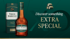
Purple Creative have recently evolved and modernised the identity and packaging for Three Barrels, the UK’s best-selling French brandy.
As a household name, widely available around the country, the challenge was to increase visibility on shelf and elevate brand recognition. The key to driving this change lay in the label, through the modernisation of the design and emphasising the iconic Three Barrels logo.
The solution was a design evolution and new identity system to create strong on and off-pack distinctive brand assets and a cleaner, more modern label refresh that added premium cues.

“Our focus was on making Three Barrels more approachable to reach a wider audience, but still staying relevant to our loyal core drinkers. The design updates will help us establish a stronger, more premium and recognisable brand and bring our iconic brandy to a new generation of people.” said Sven Rutherford, senior brand manager, Three Barrels Brandy.
But even before Purple started designing, they dug deep into the incredible historical brand archives. They discovered that over the years there had been conflicting legends about how the business, the name and the logo came about. Through extensive research, and consulting with cognac historians, they uncovered all they could about founding family, including very early 1814 labels. From the start, they featured three casks, an icon that has endured for over 210 years. Today, the three barrels icon has extra meaning, as the brandy is made using the best white grapes from Champagne, Bordeaux and Burgundy and beyond. The distilled spirit is then matured in oak to create the silky-smooth, rich and rounded taste. A fascinating history, uncompromising quality and great smooth taste. Everything you want from a brandy, rolled into one.
“It’s an honour to be entrusted with a fascinating project like this, and we hope the original founders would approve of how we’ve elevated their distinctive icon and given the brand the proud and premium look it deserves.” said Alison Coggan, group design director, Purple Creative.

When it came to design, and inspired by the research, Purple redrew the Three Barrels icon from scratch, collaborating with illustrator Chris Wormell, to firmly reinstate it as the core distinctive brand asset. To modernise and add premium cues, the shield label was simplified and the colour palette lightened. The swashbuckling initial caps were removed from the logotype, which was redrawn using a modern serif, and the old-fashioned graphic swirls and swooshes were replaced with a contemporary geometric three blend pattern. Premium craft finishes were also added to the label. The new identity was then collated in comprehensive brand guidelines.
The new Three Barrels identity and new bottles are now on shelves all over the UK.


