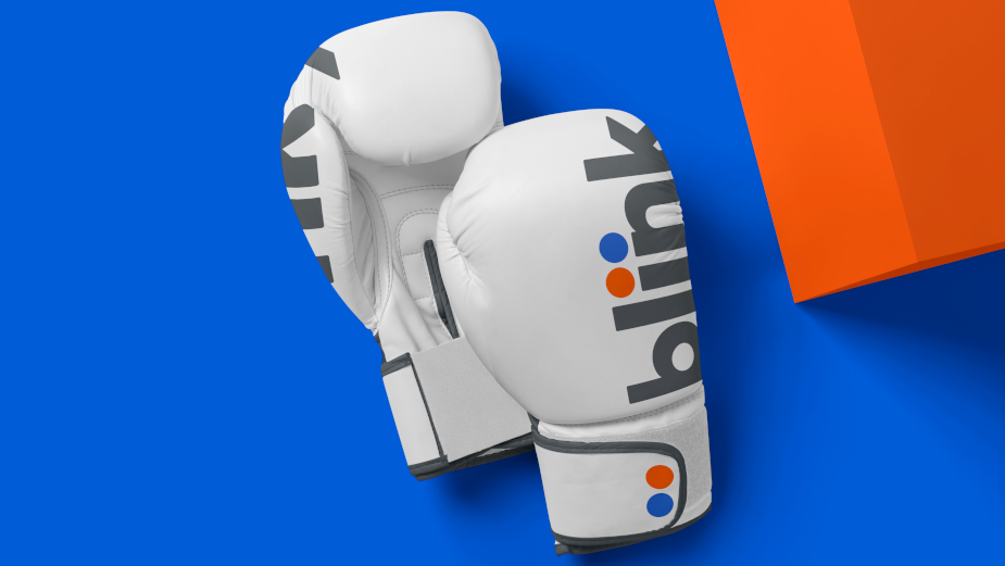
Mrs&Mr Gives Blink Fitness Distinctive Brand Refresh

Creative company Mrs&Mr has rebranded Blink Fitness, the premium and affordable feel-good fitness brand with more than 100 locations. The new visual identity system refreshes the Blink look and feel, to elevate the brand’s positioning as 'aspirational, approachable and accessible to all.'
“Through research, we uncovered that Blink’s unique selling point is ‘inner fitness.’ It’s mood over muscle. It’s how you feel vs. how you look,” said Kate Wadia, CCO of Mrs&Mr. “A clear antidote to a category that reinforces intimidation and exclusion, we positioned Blink as the friendliest and most welcoming gym - one that makes it simple and easy to get on the road to inner fitness. It’s been a personal joy to rebrand and market Blink as the proud antithesis of other gyms.”
The new visual format is anchored in a system of circles that telegraph a sense of motion and playfulness. Circles were chosen as the distinctive visual equity for their welcoming and unifying quality. They are used proudly and prominently across the organisation for patterns, photography, interiors and exteriors, on merchandise, and as the foundational element for all illustration.

Vibrant hues of blue and orange define the distinctive colour palette combination. When used together, they create an uplifting and upbeat feeling that translates well inside the gyms to create a joyful experience and are a friendly contrast to the darker colour palettes of other gyms.
To complement the system of circles, a sans serif font was selected for its openness and approachability. And Mrs&Mr created custom letterforms for the Blink wordmark. The choice of lowercase was to communicate an open and approachable tone, while the boldness of the letter establishes Blink as a proud, established national brand.

The new branding was implemented across digital media, the website, app and the interiors and exteriors of Blink gyms.
As part of a repositioning, “Feel good fitness - in a Blink” became the brand’s consumer-facing line. Beyond creative communications, the new positioning also defines the gym’s experience and innovation. Equipment is designed to make working out as simple and easy as possible - from check-in to intuitive machines and workout cards. Beyond its physical gym locations, Blink’s brand positioning informs the Blink app, with easy-to-follow workouts.


