

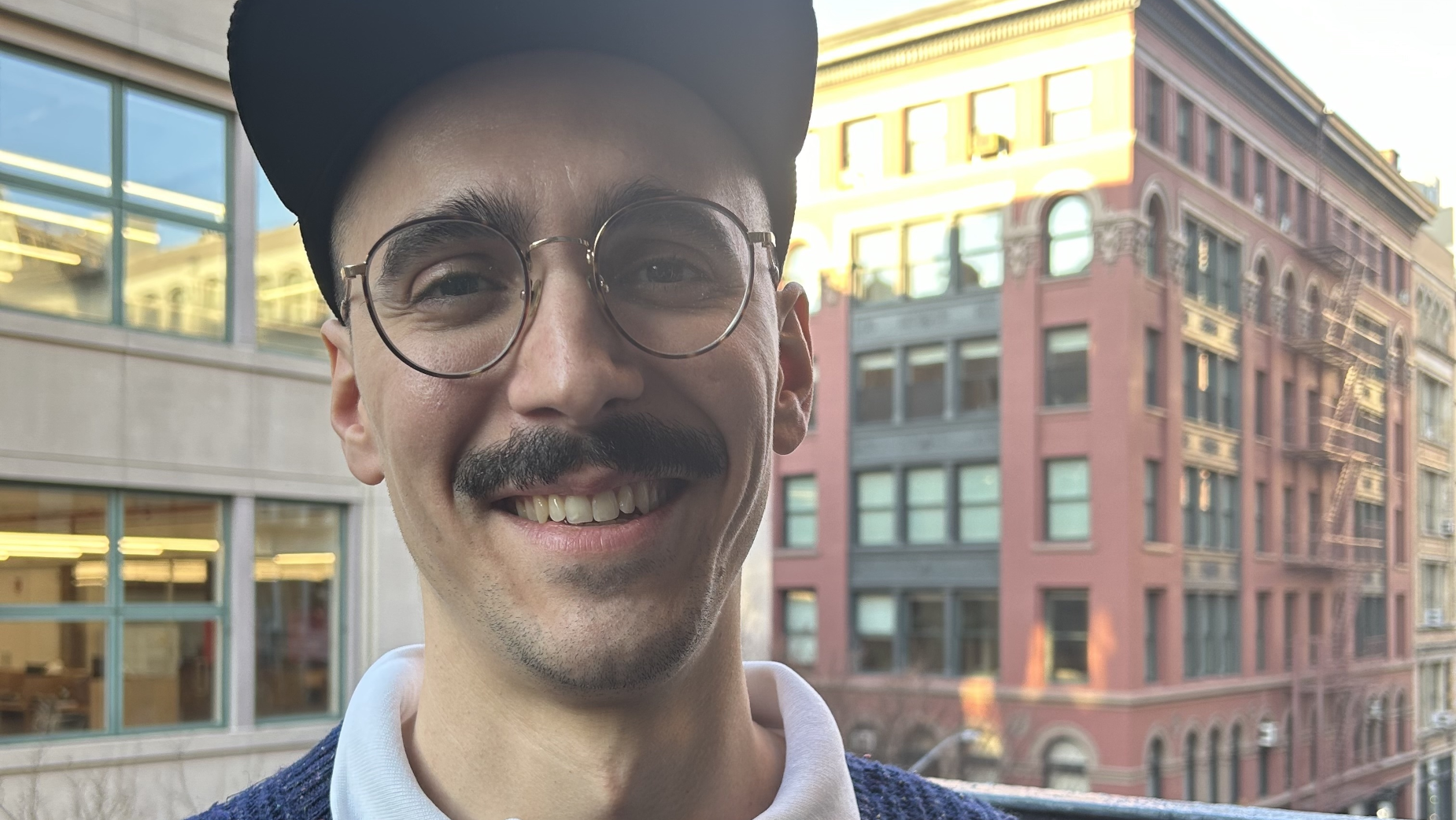
Making the Grade: Filling in the Colouring Book with Steven San Miguel

Born and raised in Miami, FL, Steven first discovered post-production at the age of 10 when his uncle convinced his mom to start digitising and editing their home movies. From school assignments to friends’ passion projects, he absorbed everything he could about the process and started a lifelong obsession with all things post. This obsession eventually led to the start of his career at VFX house Smoke & Mirrors, where he tried on a few hats as a machine room operator, Flame assist, colour assist, and editorial assist.
He left to pursue editorial and came to Lost Planet as a freelance assistant editor in 2015, where after some time, he fell in love with colour all over again and started to fill a missing link within Lost Planet’s offline to finishing workflow. He has coloured for Google, YouTube, Comcast, Bulleit, and Michelob Ultra.
Outside of the colour suite, you’re most likely to find Steven baking bread or riding his bike, though he may still be deep in a colour wormhole while waiting on his oven timer.
LBB> What was your first experience with the world of colour grading – and when did you decide that being a colourist was a role that you wanted to pursue?
Steven> I first got interested in colouring during my last semester of film school. I worked with a professor on a directed study course where I read through some colour correction textbooks and coloured a handful of student films. My first job out of school was in the machine room of a finishing company, where I also got the chance to shadow their colourist. At the time, I was still more interested in getting into editing, but I somehow fell back into colour almost ten years later.
LBB> What was the project that you felt really changed your career?
Steven> I don’t know if I can identify one project in particular, but I think covid and the acceptance of remote work really allowed me to refocus on colour as a career option. At the time, I was working as an assistant editor and only colouring small things here and there in Lost Planet’s basic colour setup in one of the edit rooms. Suddenly, with clients stuck at home anyway, the limitation of not having a nice, impressive colour suite flew out the window. I was able to sit in my apartment with just a keyboard, mouse, and calibrated monitor, and they would watch through a stream and give feedback. Of course, this isn’t an ideal way to work, but it allowed this part of the business to grow in a way I never really expected. As we booked more and more colour work, we decided to build a proper colour suite when we moved offices near the end of lockdown. From there, the momentum carried through, fortunately.
LBB> How/where did you hone your craft and did you have any particular mentors?
Steven> At Smoke & Mirrors, I assisted Stuart Wheeler. This was my first experience sitting in a professional session with clients and seeing how everything happens in real-time. He passed on a lot of little tidbits about how to handle clients during all the highs and lows of the process. Eventually, I left to freelance as an assistant editor. One of the great things about my path is that I got to sit in countless colour sessions with the best colourists at all the top houses in town. While in my first position, I only got to see how one colourist worked, but as an offline assistant, I saw how they all worked. I feel that this is where I really learned the most because I could see every decision they made in real-time. Every once in a while, a colourist would do something I had never seen before, and I’d add it to my bag of tricks.
LBB> Tell us more about your creative process
Steven> I always ask clients for references before the session starts. This way, there are no surprises when they see the first pass. Usually, these references were also used by the director and DP, and I can just enhance what was captured to make it as good as possible. Sometimes, the references are from a totally different world, and I need to work closely with the client to take what they captured and make it more like the reference without creating something really jarring. In those cases, rather than focus on matching the exact colour palette of the reference, I try to match the feel of the reference in a way that lends itself better to the footage. It’s also becoming more common for commercial DPs and DITs to provide custom LUTs used on set that clients already like. In this case, the look is mostly defined, and the grade is more a matter of general balancing and fine-tuning. This is how features and shows have worked for a long time, so it’s nice to see that level of consideration make its way into commercials.
LBB> From experience, we’ve found that colourists often love art and photography - when you’re out of the studio, what inspires you?
Steven> For me, it’s almost always other video content or films. I think colour grading is such a rapidly growing field that I’m constantly seeing new looks that inspire me. I feel like when I started getting into colour, there were a handful of common looks you would see across the board, but lately, there has been a movement toward more unique looks that encourages me to push my images further.
LBB> Colour grading is largely a digital affair, but there’s also been a resurgence of film over the past few years in commercials and music videos. What are your thoughts about working on film versus digital formats like 4K? And what are your favourite techniques for capturing a vintage or tactile feel?
Steven> I love working with film because it shows me that the director and DP made a very intentional aesthetic decision. The qualities of film that people try to emulate digitally (grain, halation, etc.) are already present in the negative, so it’s just a matter of colour at that point. At the same time, all the films I’ve worked on have been 16mm, which can be a bit more challenging than digital because it captures less information. This makes isolating colours and making finer adjustments a bit trickier.
Regarding recreating vintage looks, I love playing with the texture effects built into Resolve. One I’ve used a lot lately is called analogue damage. It has a bunch of over-the-top pre-sets, but when you dial in the settings right, you can get some interesting looks. Ironically, I’ve found it works well on archival footage that was maybe originally captured on analogue tape and has since been compressed digitally. The analogue damage tool helps return some of the analogue look to feel more like the original tape source.
LBB> When working in commercials, what role can colour and a grade play in enhancing a brand’s assets and what sort of conversations do you have with creatives and clients about that (e.g. is there often a strategic/consistent ‘look’ for a brand? Can these be too heavy handed?)
Steven> If the product is featured in the spot, I ask for a photo reference of that product. Sometimes, they also have exact RGB values, but it’s good to have an official product photo in some natural lighting. I’ll spend time upfront isolating and masking the colours as needed so we can make quick adjustments in session.
If the spot is part of a larger campaign or follows the look of a brand, clients generally express that and will send previous spots to reference. Generally, production has also done a good job following a brand’s image on the shoot for that sort of thing. Clients also have some insight from the shoot on what the brand may want to emphasise from a shot and what they might want to minimise.
LBB> How do you ensure that each colourist-director partnership is a success?
Steven> People want to work with people they like, so my goal is just to be friendly and positive. Filmmaking is probably the most collaborative creative medium, so I think of myself as just one of many collaborators serving the final product. I listen to what they want and offer my input as needed. If you can rescue something they thought was unusable, that’s a big win as well.
LBB> What advice would you give to budding colourist?
Steven> Learn everything you can online and get practising on your own footage, your friends’ footage, or even stock footage. At some point, you will progress the most by shadowing more experienced people. You can do this online with some YouTubers and sites like MixingLight and Lowepost, but it helps to witness a live working session and see how things happen. If you like and are passionate about it, just keep doing it. Building confidence in your decisions takes time, and you’ll look back at some of your first projects in horror, but that’s the nature of any creative work.
LBB> In your opinion, what’s difference between a good grade and a great grade?
Steven> A great grade starts before production, really. It’s when the director, DP, gaffer, and production designer are all making decisions to get the look they want before anyone ever steps on set. I think this is one of the dirty secrets about colour grading. We talk about it as if it’s like painting on a blank canvas, but it’s a bit more like a filling in a colouring book, as dumb as that may sound. My favourite shots of all my grades are always the ones that looked good, even at the offline stage. It’s always the shots you have to rescue that come out as just 'good' despite being twice as hard to grade as the 'great' shots.
LBB> How is the craft and trade of colour grading changing?
Steven> It’s become more and more democratised over the last ten years with the release of Resolve Lite. When I started using Resolve, there weren’t a lot of resources available online. As it has grown in popularity, not only as a colour correction tool but also as an editing tool, YouTube has become inundated with tutorials covering every imaginable topic. There are pros and cons to this. On the one hand, there is a lot of bad information out there, and people are trying to sell you garbage pre-sets and 'masterclasses.' On the other hand, you can learn absolutely everything you need to start digging into colour. It’s cool to see even the most novice filmmakers thinking about colour in a way that my peers were not.


