


Making the Grade: CJ Dobson Thinks Real-World Inspiration is Underrated

CJ Dobson is a respected senior colourist with 16 years of experience in the screen industry working across commercials, film and TV.
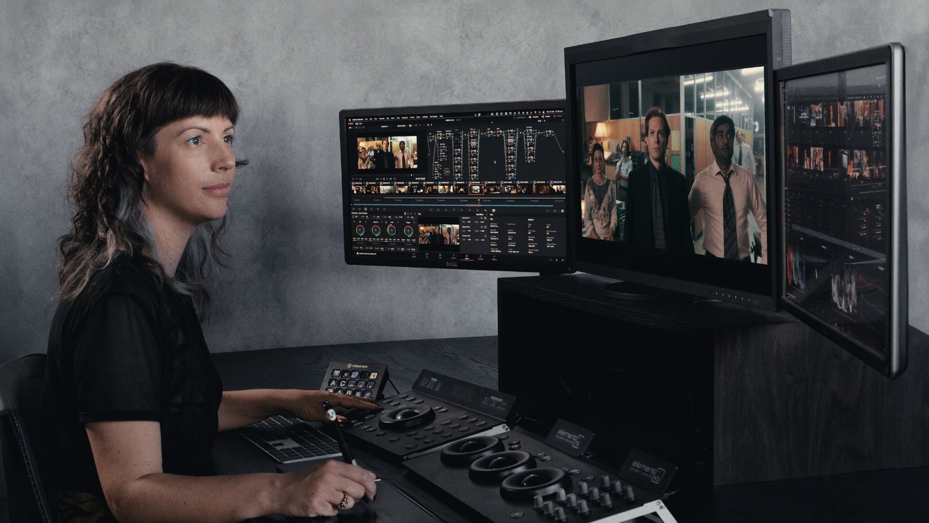
In 2022, CJ founded Moodlab, a high-end colour and finishing facility. She has graded acclaimed projects, including the Academy-nominated 'Tanna', Palme d’Or-winning 'All These Creatures', and Emmy-nominated 'The Newsreader' and 'Deadloch'. Recently, she graded the prequel to 'Rosemary’s Baby - Apartment 7A', and Neon’s 'Together'.
CJ is well-respected for her technical knowledge and played a key role in the transition from film to digital formats at Digital Pictures, a pivotal moment in Australian post-production. As one of the last generation of telecine film colourists in Australia, she brings expertise from both the analogue and digital worlds.
An active contributor to the industry, CJ has spoken at The Wheeler Centre, taken part in various panels, and hosted educational events at her studio, Moodlab, fostering knowledge-sharing within the screen community.
LBB> What was your first experience with the world of colour grading -- and when did you decide that being a colourist was a role that you wanted to pursue?
CJ> We had a class on Final Cut Color in film school, and I was immediately hooked. At the time, colour grading was seen as a dark art. Professional suites were prohibitively expensive to set up (around AUD$1 million), so it was never suggested as a career path, even though I was grading my classmates’ projects and even some of our lecturers’ personal work.
Six months into freelancing as a post-production all-rounder, word started to spread and people began hiring me specifically as a colourist. With software becoming more accessible, I was able to teach myself and eventually connected with a studio that had its own grading suite. I became their in-house colourist. When they produced a feature film, I had the opportunity to shadow the senior colourist, who gave me invaluable advice: get into a large post facility.
That’s what led me to Digital Pictures in Melbourne-then one of Australia’s biggest post houses. I was lucky to work as a telecine colourist before our industry transitioned away from film to digital cameras.
LBB> What was the project that you felt really changed your career?
CJ> 'Tanna', a feature film made with locals in Vanuatu who still live traditionally. It was a small crew and a challenging grade, but it went on to be nominated for an Academy Award -- which was huge. Before that, I was known mainly for commercial work. Getting into long-form content made me a stronger colourist for commercials, and I believe my commercial background made me a stronger commercials colourist. Long form = speed and dramatic looks. Commercials = client relations, polish, complexity and precision.
LBB> How/where did you hone your craft and did you have any particular mentors?
CJ> I got better by putting in the hours. I was lucky to have great mentors at Digital Pictures: Martin Greer, Edel Rafferty, Dee McClelland, and Brett Manson. They were generous with their knowledge. Watching how differently each of them approached a grade helped me realise there’s no single “correct” method -- just find what works for you.
LBB> Tell us more about your creative process - (e.g.when you get a project, how do you go about developing a look?)
CJ> The best results come when colour is involved early - before the edit starts.
In film and TV, we typically build a showLUT so lighting and exposure are shaped around the intended look. The main reason is that people get used to the offline, even if it’s flat or white-balanced incorrectly. Once people become used to an image, they perceive it as “natural”, and it gets harder over time to convince the whole team to accept a different look in the grade.
We get that not every TVC is going to have the time and resources to run camera tests and build a robust showLUT. But we highly recommend a dailies workflow. It sounds like it would cost more but in fact, this process can end up saving a production money because you’ve got a pass across everything before you step into your final colour session. All your dailies have a look and a balance has already been applied.
We’ve also taken it a step further and implemented a shared cloud filespace so that the files can be easily replaced during the edit. This is helpful if the team want to make some tweaks for a presentation. All of our dailies adjustments and colour workflow is designed to carry into the final grade so we’re always taking a step forward.
LBB> From experience, we’ve found that colourists often love art and photography - when you’re out of the studio, what inspires you?
CJ> I feel like real-world inspiration is underrated. I’m very tuned into my environment and how light, colour and atmosphere interact. And with HDR now becoming standard, I’m seeing the world differently again.
Of course it’s great to see the styles filmmakers and photographers use in their work. I also like gauging how non-industry people react to strong looks -- when do things start to feel pushed? It’s useful to know where that line is, especially as audiences become more visually literate.
LBB> Colour grading is largely a digital affair, but there’s also been a resurgence of film over the past few years in commercials and music videos. What are your thoughts about working on film versus digital formats like 4K? And what are your favourite techniques for capturing a vintage or tactile feel?
CJ> We have incredible tools these days to emulate film. But nothing quite beats the real thing. Film can be scanned at 4K, particularly 35mm film is an absolutely stunning format. For a more lo-fi look, there’s 8mm and 16mm and I think the VHS trend is fun for certain projects.
We’re actually remastering an old film at Moodlab from 35mm film to HDR 4K, which is incredibly satisfying to see all of that information which was captured on the film. I feel like we’re finally doing these old films justice!
Digital formats have overtaken film in regards to dynamic range so, particularly when displayed in HDR, they look closer to how our eye can see. With the added stops available to us now, comes a responsibility to not overcook the image. We all remember the early days of HDR capture which most of the time looked horrible and unrealistic. HDR display is a whole new world where we have 10 times the space for our image to sit within, it is more important than ever to work with a colourist who has a highly tuned eye and intuition.
LBB> When working in commercials, what role can colour and a grade play in enhancing a brand’s assets and what sort of conversations do you have with creatives and clients about that (e.g. is there often a strategic/consistent ‘look’ for a brand? Can these be too heavy handed?)
CJ> It really is brand dependant. I feel that the threshold on how far to go with a look is often played quite safe (at least in Australia). You can actually push things pretty far before the audience starts to notice and it would make sense to me that in order for something to stand out, it’s given a look.
Then again, our audience is becoming more savvy, so if you’re trying to have a down to earth relatable feel and don’t want to portray an overly polished feel, then not overdoing the style and look might be best for that brand.
LBB> How do you ensure that each colourist-director partnership is a success?
CJ> In Australia, the colourist's first job is to execute the director and DOP’s vision. We present that united front to the agency, and then all together put this forward to the client.
Understanding that hierarchy is important. It’s not about putting your stamp on things -- you have to enjoy collaboration. The best partnerships evolve to the point where I can anticipate what the director wants and make adjustments before they ask. That’s when the magic happens.
LBB> What advice would you give to budding colourist?
CJ> Practice practice practice. Find ways to get your hours up. Try not to get stuck in the weeds by sitting on a frame for too long. Use references to reset your perspective.
LBB> In your opinion, what’s difference between a good grade and a great grade?
CJ> A great grade is when the whole team walks away feeling excited and when the look captures the attention of the audience and communicates mood without detracting from the story or message.
LBB> How is the craft and trade of colour grading changing?
CJ> The tools are more accessible than ever, but to master the craft, it still demands time and discipline.
Audience tastes are evolving, HDR is becoming the standard, and that’s going to reshape the process in exciting ways.


