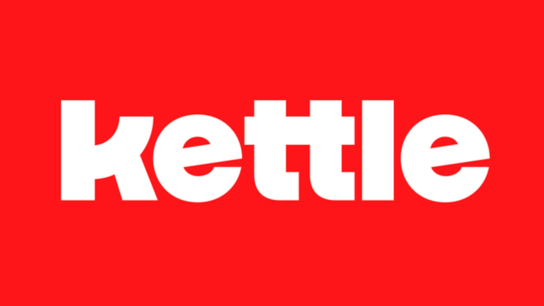
Kettle’s Future, in Bold Letters: A New Look for a New Era

With several big moves on the horizon, the moment felt right to unveil our evolved identity. Like all good stories, this one starts with people.
From two of us in my Williamsburg apartment kitchen to over 200 teammates across the globe. From micro digital design studio to digital partner for the world's most ambitious brands. As Kettle marks fifteen years, we're evolving our identity for the next chapter.
When we set out to evolve our brand, we knew we needed something that reflects both our clients' ambition and the spirit of human connection that drives our work. In our search for the right partner, Carlos Oliveras Colom's work resonated with us immediately. Born and raised in Puerto Rico and now based in New York City, he creates letters fuller than life, with an expressive style meant to be seen and felt. His work, rooted in equality and championing the underdogs, aligned perfectly with our values. Working closely with our creative director Thomas Nicholas, who brings deep branding experience and strategic vision, they created something that perfectly balances bold creativity with purposeful design.
The creative process was remarkably clear and efficient. While we explored several directions, this one immediately stood out. There was a natural gravity to it that we all felt. The result balances simplicity with thoughtful detail. Geometric letterforms speak to our precision and clarity, while a subtle easter egg in the 'k' reveals itself as a teapot silhouette, a playful nod to our name and the collaborative spirit that has defined us since our early days.

Looking back at how design has evolved since 2009, it's remarkable to see the changes. From skeuomorphic app icons to flat design, from ornate web layouts to minimalist interfaces, the industry has seen dramatic shifts in visual language. Through these changes, our logo has maintained a consistent thread: strong, friendly letterforms that reflect our human approach. Each refinement has been purposeful, mirroring our growing sophistication while preserving that essential character.
Our 10th anniversary in 2019 marked a significant milestone with the introduction of the 'X' element, a symbol of how creativity and technology intersect in our work. This mark became a defining feature of our identity for the next five years.
This identity is more than a refresh: it’s a statement about Kettle’s future. As we deepen the integration of strategy and creativity, expand into emerging technologies, and double down on meaningful industry impact, this evolution reflects where we’re going, always pushing forward while staying true to the human-centred approach that has defined us from day one.
I'm incredibly proud of what Kettle has become, and even more excited about what lies ahead. This new identity honours our past while embodying our future. It's intentionally simple, consistently bold, and unmistakably Kettle. A beautiful reflection of what’s to come for us, in ways that have been fifteen years in the making.


