How Far Can We Push It? The Creative Risks That Keep Mailchimp Ahead of the Game

Mailchimp remains unrelenting in its commitment to educating and assisting customers through innovative marketing strategies. And its strength lies in unique storytelling concepts, whether creating a playful experiential activation to showcase the sensory aspects of email, or illustrating a whimsical world where user challenges transform into a tangle of ‘Clustomers’. By embracing ‘absurd’ ideas and blending humour with relatable messaging, Wink Creative – its in-house creative agency – makes complex marketing concepts accessible to Mailchimp’s broad audience.
Guided by a belief that taking risks creates opportunities for the unexpected to happen, the agency exists to capture the attention and imagination of marketers and entrepreneurs around the world. Eccentric in approach and meticulous in execution, Wink Creative’s consistently attention-grabbing marketing efforts across event activation, motion design, and production have garnered widespread success.
Keen to learn more about the method behind the madness, LBB’s April Summers explores three of Mailchimp and Wink Creative’s most noteworthy campaigns to date. She quizzes key team members Christian Widlic, Rhett Kearsley, Rachel Yonda and Carlos Escobar on what Wink Creative set out to achieve with each campaign, why they decided on these creative approaches, and how this work exemplifies the power of taking creative risks.
Email Is Dead
Christian Widlic, global head of brand design
Our goal here was to celebrate email in a bold, creative way that had never been done before. But how do you bring excitement to a topic often seen as dry, and get people genuinely excited? We also wanted to make a strong entry into a new market (the UK), which presented a unique challenge: how to create a meaningful connection while respecting the cultural nuances of that audience. And, since we were speaking to marketers, the campaign had to strike a delicate balance, being informative and smart, yet also weird and intriguing enough to make an impact and leave a lasting impression. Above all, we asked ourselves, ‘how do we make email fun?’.
An interactive exhibition felt like the most powerful way to achieve this. It allowed us to immerse people in an experience that would spark broader conversations about the future of communication and capture the full spectrum of emotions that email evokes.

This project was a masterclass in creating a truly cohesive brand experience, where every element – from architecture and product design to scent, sound, and tactile interactions – was meticulously crafted. It pushed us to explore the full spectrum of creative possibilities, blending physical and digital realms seamlessly. We learned that no detail is too small, and no idea is too ambitious.
Partnering with one of the world’s most renowned design museums reaffirmed our belief that the only limit to what we can achieve is the scope of our imagination. The project inspired a boldness in our approach to future campaigns. If you don’t ask, you don’t get, and this experience proved that even the loftiest creative ambitions can be realised when we push boundaries and think beyond the expected.
Taking on the 'Email Is Dead' exhibition was, in itself, a huge creative risk. Corporate exhibitions can be tricky, and we had real concerns about whether people would show up or engage in the way we hoped. But the results were beyond anything we expected. The exhibition drew over 25,000 visitors, collecting 17,000 emails along the way. Within the first 24 hours, we saw 84 million media impressions, 61 million OOH impacts, and over 14 million digital impressions. It was a testament to the power of taking bold, creative risks and letting the unexpected unfold.
Turn ‘Clustomers’ Into Customers
Rhett Kearsley, lead producer
The imagination is such a powerful thing! My mind initially went to all the ways we could bring the 'Clustomer' to life... graphically, character-driven, stunts, effects... In the beginning everything is so expansive and the excitement of blockbuster-type visuals kind of floats as a tease any time you're playing with the fantastical. Of course, we begin to dial things toward what is right for our brand, for the message and purpose of the campaign. We are quite selective in curating the right partnerships to bring these ideas to life. Those collaborations form the very intentional reductive part of the process, which almost always nets a different outcome than the "dream-state" of the initial concepting phase. That said, we did end up really close to what I had in mind, albeit a much better and purposeful final product than could be predicted on day one.
Our approach was to create our 'Clustomer' as practical as possible. There's a charm and nuance to the 'real' that adds to actors' performances and really helps achieve the magic that represents our brand. We built a giant jungle-gym type ball that our performers were then squeezed into. From there we had people jumping, flipping, and interacting with each other in interesting ways to personify the tedium and release of being stuck in a Clustomer. We enhanced the ball with cleanup and a few additional CGI props and body parts to fill out the space and add to the depth and texture of our Clustomer.
With regards to AI, we are always searching for ways to integrate that into the production process. It has become a critical visualisation tool in proof-of-concept, pre-visualisation, etc. There are moments we find uses for Gen AI in the final products - think background art, cleanup, environments. However, at the moment we're finding the human touch is the right way to go for the critical storytelling and action.

With so many ways to reach our audiences, it's imperative to meet them where they are. We employ a fit-for-platform creative strategy across all layers of our marketing funnel to make sure we have messaging supported by impactful design in every point along the customer journey. We use a plethora of resources and partners across channels to monitor performance; including AI tools that give us really interesting insights, heatmaps and data to take into our optimisations efforts.
I've been so happy to see and hear the excitement about the quality of the craft, and hitting the mark on the brief. We've won awards, and garnered some really impressive awareness and acquisition results. It's a great feeling to be recognised within our trade, and be part of revenue-driving results for our business.
'FROM: HERE, TO: THERE'

Rachel Yonda, senior motion designer
The main stage of our 2024 event, ‘FROM: HERE, TO: THERE’, was a unique opportunity to curate an experience that would immerse our customers and high value prospects in a physical environment suffused with transcendent creative direction.
Throughout the event, industry-leading experts took to our uniquely-designed stage to showcase a multitude of innovative techniques and advanced marketing strategies against a visually stunning backdrop of motion graphics, displayed on an expansive custom-built screen that reached the ceiling and curved to extend above the audience.
The event motion system leveraged light, colour, momentum and depth in an effort to meet and elevate the quality of the presentation experience. We utilised the expanse of the screen to play with perception, hinting at illusions to create engaging intrigue rather than overwhelming disorientation. The motion system acted at times as a pendulum between simplicity and complexity, oscillating between two and three dimensions, seeking to abstract and distil the power of our product features to bring our customers from where they are, to where they desire to be.
Carlos Escobar, global creative director
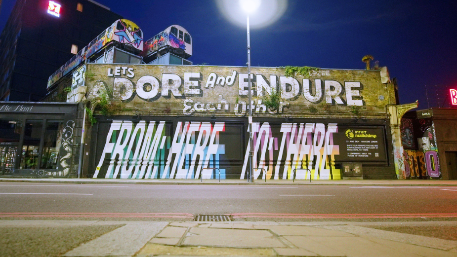
'FROM: HERE, TO: THERE' is all about celebrating the creative magic that happens in between the here and the there. It’s about journeys, empowering guests with a curated program of inspiring talks, panels and conversations. Through a compelling custom mural painting, we built awareness of and attention for From: Here, To: There in a unique style true to Mailchimp.
The final wording for these billboards came from a desire to be informative enough that people are curious to learn more about FHTT, but we didn't want this mural to feel like another ad. Further establishing our undisputed presence in London, we wanted to re-engage with the Adore and Endure mural in East London. This placement is uniquely suited because it is at eye level, providing great exposure for both pedestrians and vehicles – and perhaps even the opportunity for interaction and social UGC.
In terms of overall reaction and social/digital insights - through a spread of custom OOH and D6 tube and roadside placements, we were able to catch London’s attention - especially by repeating our presence in Shoreditch with you custom mural, which is an area which indexes highly for Markets and Agencies, during work and leisure times. Over the course of four weeks, the mural activation had 1.4 million impressions, and over the course of the two weeks leading up to the conference, the D6 placements had 11.7 million impressions.


