


How CHEP Brought Samsung Back To Their Grocery Store Roots

When receiving a new piece of technology, the best part of the experience is the unboxing.
The smooth edges of the cardboard, the peeling back on the plastic tape, and the unveiling of the scratch-free, fingerprint-free, case-free black screen of a new smartphone. It’s goosebump worthy stuff.
CHEP has taken this to a whole new level of excitement, designing the unboxing experience to not only entertain but also educate the user on the phone's abilities.
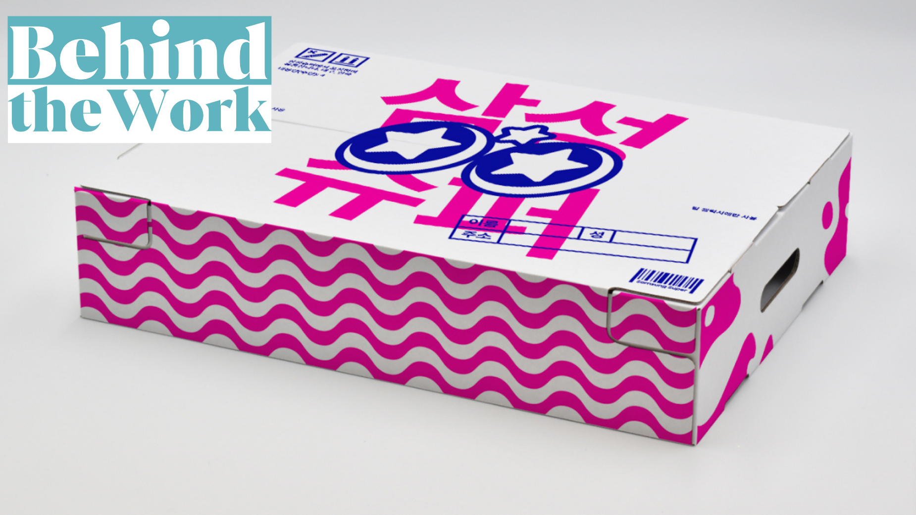
Designed like unboxing something you’d buy from a Korean grocery store (a homage to Samsung’s roots), the unboxing experience is elevated. With all information almost entirely in Korean, the unboxing prompts the use of the translation feature of the phone.
CHEP used social media to their advantage when sending these special boxes out to influencers. The influences created scroll-stopping videos on their behalf featuring the decked out packaging.
Paul Meates talks to LBB’s Casey Martin on the incredibly clever way of using social media marketing and product demonstrations.
LBB> What were the inspirations behind this campaign? What was on the drawing boards?
Paul> Our inspiration was really Korean Wave, or “Hallyu”. It’s clearly taking the world by storm. But despite this cultural shift, Samsung are yet to flaunt their Korean roots in Australia. While people might know Samsung started in Korea, what most people don’t know is that before they were a tech titan, Samsung was a Korean grocery store trading noodles, dried fish and other Korean produce. When we discovered that, we got really excited about how that history might be applied to their latest tech release.

LBB> With the success of the initiative, is there a future where we will see more projects like these?
Paul> We hope to see more brands lean into their heritage, rather than obsessively trying to fit in. I hope in some small way this project proves that by not fitting in, you obviously stand out. Australia is a melting pot of cultures, and it’s so nice to see a melting pot of brands that reflect that. I remember seeing Asahi ads written in Japanese in Melbourne street press years ago. I couldn’t read a word, but to me, it gave the brand a wonderful feeling of authenticity, and it has stuck with me.
LBB> What were the challenges and what did you learn from them?
Paul> The whole project had to be created in Korean, so we needed a robust translation process. Everything was written in English first, then translated by one translator, then checked by another. On Samsung’s side, the translations were again reviewed by a fluent Korean speaker. This process began at the very start of the design process to give us material to work with, and then had to be repeated at the end to ensure accuracy.

LBB> What was the biggest highlight from this campaign?
Paul> The highlight creatively was being given the opportunity to create a lost-in-translation feeling for the receiver of the work. That is a rare occurrence in advertising. Interestingly, we found along the way that making the wrong decisions helped to enhance that lost-in-translation feeling – for instance, the decision of putting an octopus on the milk carton was intended to make the viewer wonder if they’re missing some context.
LBB> The design of the unboxing material is amazing, talk us through the creation process?
Paul> Like all design processes, it began with research – looking both at the modern-day shelves of Korean supermarkets and the visual history of Samsung. Every aspect of the design became a blend of the two. Our sustainably produced reusable plastic bag borrowed the wheat and 3-star elements from Samsung's original logo. The 3-star motif reoccurred as a glint in the eye of the brightly-coloured characters that adorned our Korean packaging. And our welcome booklet was crafted to look like a grocery catalogue, with a receipt stapled to it detailing the contents of the package.

LBB> To include a product demonstration of the translation feature of the phone within the unboxing itself is a brilliant idea! What challenges did this present, if any?
Paul> The moment influencers receive something from a brand is a moment every brand hopes will lead to unprompted posts. Because we couldn’t ask the influencers to use the tech (or else pay for the privilege), our task was to ensure we necessitated its use, which we did in spades. Of course, you never know how it will go, but thankfully the response has been incredible. We saw a 400% uplift in unprompted posts, reached over 5 million followers, and if it’s any gauge, the project received more “OMGs” than any project I’ve ever been involved in.


