How a Dutch Wallet Brand’s Unconventional Brief Provoked a Timeless Digital Flagship Store

Secrid is a Dutch family business that has been around since 1995. Their signature wallets have been vastly successful over the years and, as a result, have been copied and imitated over a thousand times*. But despite creating an iconic product, there was still room for Secrid to reach even more consumers and use the full potential of their digital platform. We immediately took on this challenge and embarked on a year-long journey to help make this happen.
Our assignment was far from ordinary, as the initial design brief we received managed to both bemuse and stimulate us. The requested mix of aesthetic values – the experience of reading a newspaper, the authority of a design academy, the clear signing of Schiphol airport, the yin-yang balance of Buddhism, the warm feeling of a jazz concert, the experimental character of a design lab, the style of an Italian espresso bar, and a sustainable standard weaved throughout – was quite the provocation.

To convey and incorporate all that, we had to get very familiar with the brand. We started out by doing a strategic alignment around their brand positioning and business goals which provided us with a clear initial starting point. We then looked at the Secrid physical points of sale, and especially their flagship store in Rotterdam, where we were immediately struck by a distinct, in-person connection. More than just a showroom, this is a space where visitors are invited to enjoy a cup of coffee, take a peek behind the scenes at how everything is made, and even customize their favourite wallet on the spot. We immediately knew we had to translate that feeling into the digital flagship store, so we set out to emulate the store’s warm feel and personal touch, all while keeping it instantly recognisable to anyone familiar with the products.

Through bi-weekly sprints, we worked very closely with the Secrid in-house teams who provided us with real-time, valuable feedback. This led to the creation of a design language that bridges the gap between the physical touchpoints of Secrid and its digital presence. The collaborative design approach enabled us to get an in-depth understanding of the brand’s values and ultimately deliver a digital flagship store that matches their mission and vision.

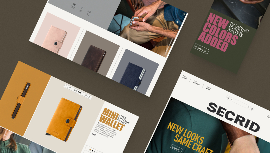
The final result – secrid.com – is both instantly comfortable and visibly evolutionary. The large numbers are a nod to Paul Mijksenaar’s Amsterdam airport signage, while the overall layout and narrow paragraphs are inspired by magazines. Inspired by newspaper covers and the old-school kiosk vibes, we developed the posters and Collections page. The Mix & Match section – where users can configure their wallet – is influenced by the explorative and experimental character of a design lab, where Secrid designers test new materials, colours and techniques. We wanted to bring that physical element to the website and offer the customers the ability to do the same thing. The big, bold typography is a nod to the emblematic Blue Note Records’ jazz label, and their striking LP covers from back in the day. Finally, we even developed a dark mode option which is meant to save energy.

As the Secrid wallets are intended to develop a certain patina and last for years – and even longer via the brand’s promise for care and repair – we too sought to create something that was both timeless and personal. By doing so, we empowered Secrid to move towards being a more direct-to-consumer brand and enabled them to inspire more people in making sustainable choices.


