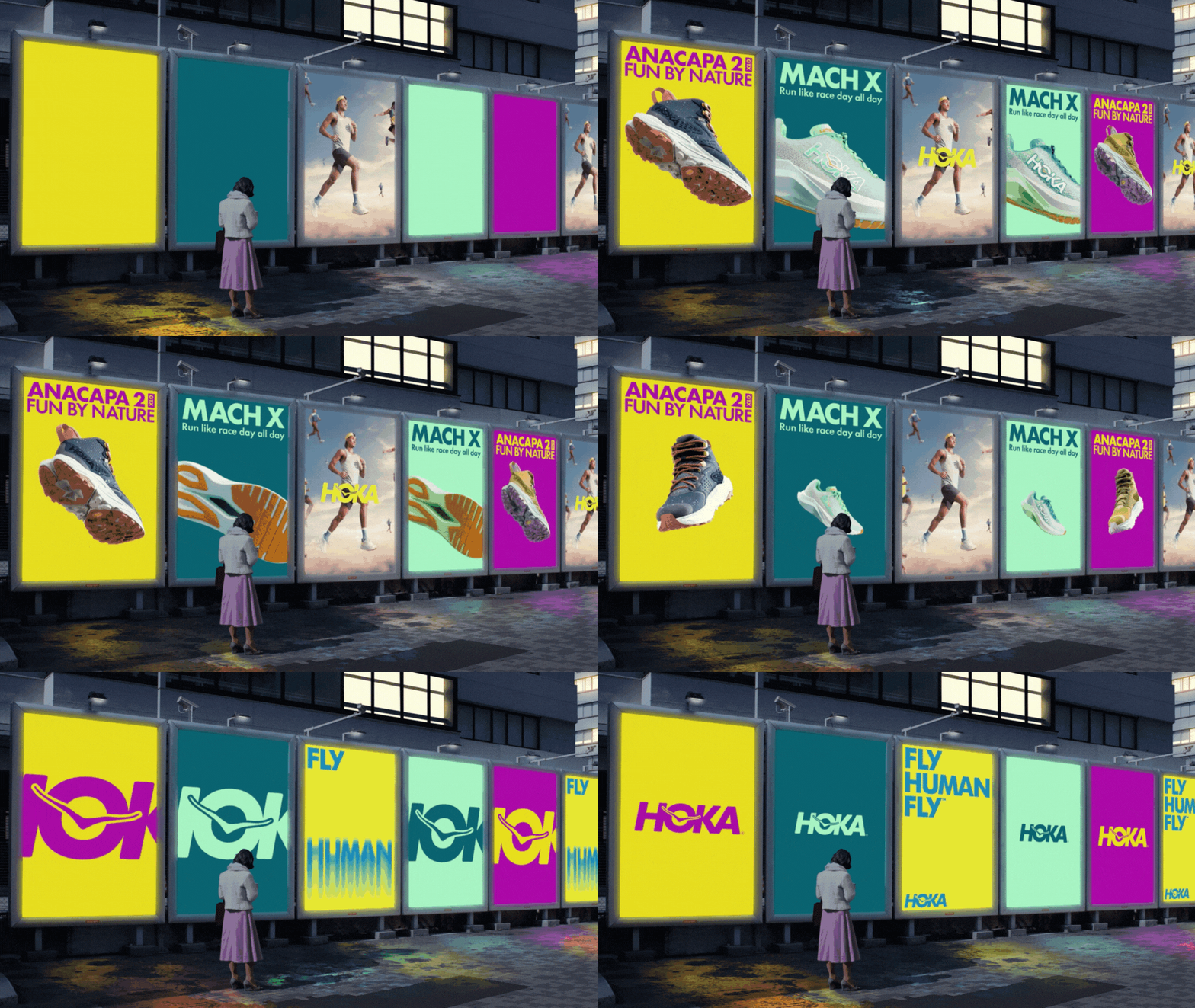
HOKA Conquers All Capabilities in New CG Campaign

Activewear brand HOKA has released a new campaign to launch its Anacapa 2 and Mach X shoes, with the talents of CGI and animation studio Steelworks.
The pair of films utilise meticulously crafted graphics to emphasise each shoe’s unique capabilities. For the Mach X, dynamic animation coupled with a swift edit epitomises its suitability to speed and agility, while detailed textures highlight the Anacapa 2’s adaptability to any terrain or weather, perfect for trekking and outdoor adventures.
Anomaly LA set Steelworks the task of rendering and animating two campaigns demonstrating the distinct selling proposition of each shoe. The two worked in close partnership to carefully enhance the shoes’ aesthetics, especially when integrated with the typography - strategically used to provide cohesion across all elements - for the promotional posters.

The campaign comprises a vast array of assets, from live action to banners of various sizes showcasing shoe animations alongside typography and incorporated photography. To handle the sheer volume of final deliverables, Steelworks developed a versatile template that served as an anchor. This enabled the team to easily adjust elements like typography, colours, and imagery while ensuring consistency and adherence to the brand.
To further streamline the process, Steelworks utilised collaborative tools that kept the team in sync, reducing overlap and optimising efficiency. By organising assets systematically, delegating tasks, setting regular checkpoints, and introducing quality assurance steps, they were able to manage the project's scale effectively, meeting tight deadlines while maintaining high standards.
Steelworks employed a mix of tools on the project, blending techniques from each to create a unified aesthetic. After Effects was used for text animations, Photoshop for image retouching, Cinema 4D for shoe animation, and Houdini for special effects.
To elevate the campaign, Steelworks conceptualised two directors cut that show the shoes in motion, amplifying the visual narrative while maintaining coherence with the overarching campaign style. This inspired the team to push creative boundaries, ensuring that every detail, from motion to aesthetics, aligned seamlessly with the campaign's identity.
Nidia Dias, creative director at Steelworks, comments, “Crafting this graphically-oriented campaign was a rewarding experience: it allowed us to offer a fresh perspective, not just in presenting the product but also in demonstrating our unique approach to such projects. With our director's cut, our intention was to go beyond the conventional, honing in on essential features and personality to amplify the product’s core essence. This approach not only showcased it in a new light, but also underscored our commitment to innovation and creative exploration. We believe this project embodies our ethos: to distil the fundamental and build upon it in imaginative and resonant ways.”


