High Five: Sonic Logos That Stuck

I started DLMDD with three friends after a fight in a pizza joint with my old boss. We're now a team of nine and the team are ace! We're modestly coaching the world how to do sonic branding properly. I play drums. I make and find music for commercials and other film stuff. I once helped throw James Blunt off a cliff. He didn't die. Here’s my selection of top sonic logos from the past year...
Cinch's Sonic Logo
Agency: IRIS
When Rylan Clarke isn’t demanding friends 'gimme the f***ing gear', he’s on our screens with this overlooked sonic gem for online car dealership Cinch. Based on stickiness of the melody alone, this uber-simple whistle motif is an unignorable earworm. And when visually paired karaoke-style with Cinch’s signature line “carrrrs without the faff!”, it fully materialises into a cracking piece of branding, musically driving home Cinch’s core message. Annoying, effortless and catchy in equal measures; Cinch has ticked all the boxes of a brilliant sonic logo.
Betway - 'The Sound of Entertainment'
Agency: Saatchi & Saatchi
Sound: DLMDD
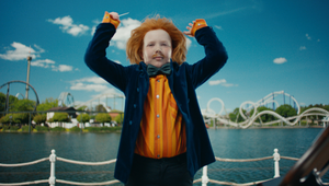
ENNNN-TERRRR-TAINNNN-MENTTTT! Betway’s new sonic, developed by DLMDD, delivers the unique feeling of thrill and excitement synonymous with the brand. But beyond just a great sonic logo, this project for Betway illustrates just how much bran impact can be packed into three seconds of sound. We’re delighted to see it receive industry attention, being named as 'Best Newcomer' and 'One to Watch' in the Top 10 Sonic brands by marketing guru, Mark Ritson.
Acast - 'The Acast North Star'
Audio branding by an audio brand; Acast’s two-ish-second sting had no option but to be fucking fantastic, and luckily, it is. Heard hundreds of millions of times a week across the world, this massive podcast production and distribution house has intelligently weaved themselves into the fabric of all their releases. Their new bespoke sonic logo, the ‘Acast North Star’ (very glam title guys) book-ends every Acast ad break, and is an effortless yet polished piece of sound design. The power of this sonic is its subtlety - it gently sits alongside content rather than interrupting it, and soon enough you get used to hearing it. It gives the listener a little moment to become aware that they’re about to hear an ad, rather than launching straight into it and disrupting the flow of the pod. Based around 'A star-like gleam, a sense of movement, openness, and storytelling' - (ehhh, sure) - it certainly has a celestial charm. Ranking at 68/100 on the US’s best sonic logos 2022 by the second-highest newcomer on the list, SoundOut, we’d put money on this sophisticated sonic rising through the ranks in the coming years.
Three's Mnemonic
Agency: Wonderhood Studios
Sound: Foster & Foster Music
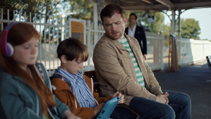
In 2020, Three ended their long running and hugely furtive 10 year creative partnership with Wieden + Kennedy to partner up with relative new kid on the block, Wonderhood. The appointment came with a complete brand refresh, which saw Three leaving behind the supercharged, futuristic, oft frenetic advertising, with which it had become synonymous for a slower-paced, more down to earth brand positioning, which kicked off with last year’s campaign 'Life needs a big network'. The brand re-fresh also featured a brand spanking, shiny, new mnemonic. And a great job they’ve done too. The execution is simple - three (see what they did there?) ascending major chords played on the piano, overlaid with typical phone SFX; a phone vibration notifying an incoming message, followed by the ‘whoosh’ sound that accompanies an outgoing message. Simple, recognisable and very effective. Most importantly, the mnemonic needed to reflect Three’s new brand messaging - one of genuine human connection and shared, relatable moments between people young and old (a far cry from the Gen-Z-focused campaigns of yore) and this mnemonic does just that. It’s modest, warm, inviting, easily digestible and seemingly broad appeal while remaining distinct and ownable to Three.
The Sound of Kathmandu
Sound: MassiveMusic
Creating a bespoke bird call for your sonic identity? That’s brave! Outdoor and adventure lifestyle brand, Kathmandu, set out to create a sonic identity that reflects their spontaneous and joyful spirit. They started by capturing field recordings of real people enjoying the outdoors, sprinkled in a catchy melody which had the ability to resonate with contemporary music culture, (played on wooden instruments, of course) and, if that wasn’t enough nature for your ears, they even created their own bird call to top it all off, played through a bespoke, handmade instrument which was crafted out of sustainably sourced wood. Phew. Notify Greta Thunberg! Someone’s coming for her crown! An ornithologist was even brought in to ensure the bird sounds were authentically, err...birdy enough. That’s dedication to the craft right there, folks! The result is a distinctive sonic identity which perfectly encapsulates the real-world, outdoor, playful essence of the brand. Huge props, Massive!


