


Colossus Develops New Brand Identity for the Boston Symphony Orchestra

Creative, design and advertising agency Colossus has developed a new brand identity for the historic Boston Symphony Orchestra (BSO) and its sub-brands The Boston Pops, Tanglewood, and Symphony Hall, co-founder and ECD Travis Robertson announced today. The agency also worked to craft a new brand strategy and brand architecture for the BSO. This is the agency’s first project for the client after winning the business in 2021.
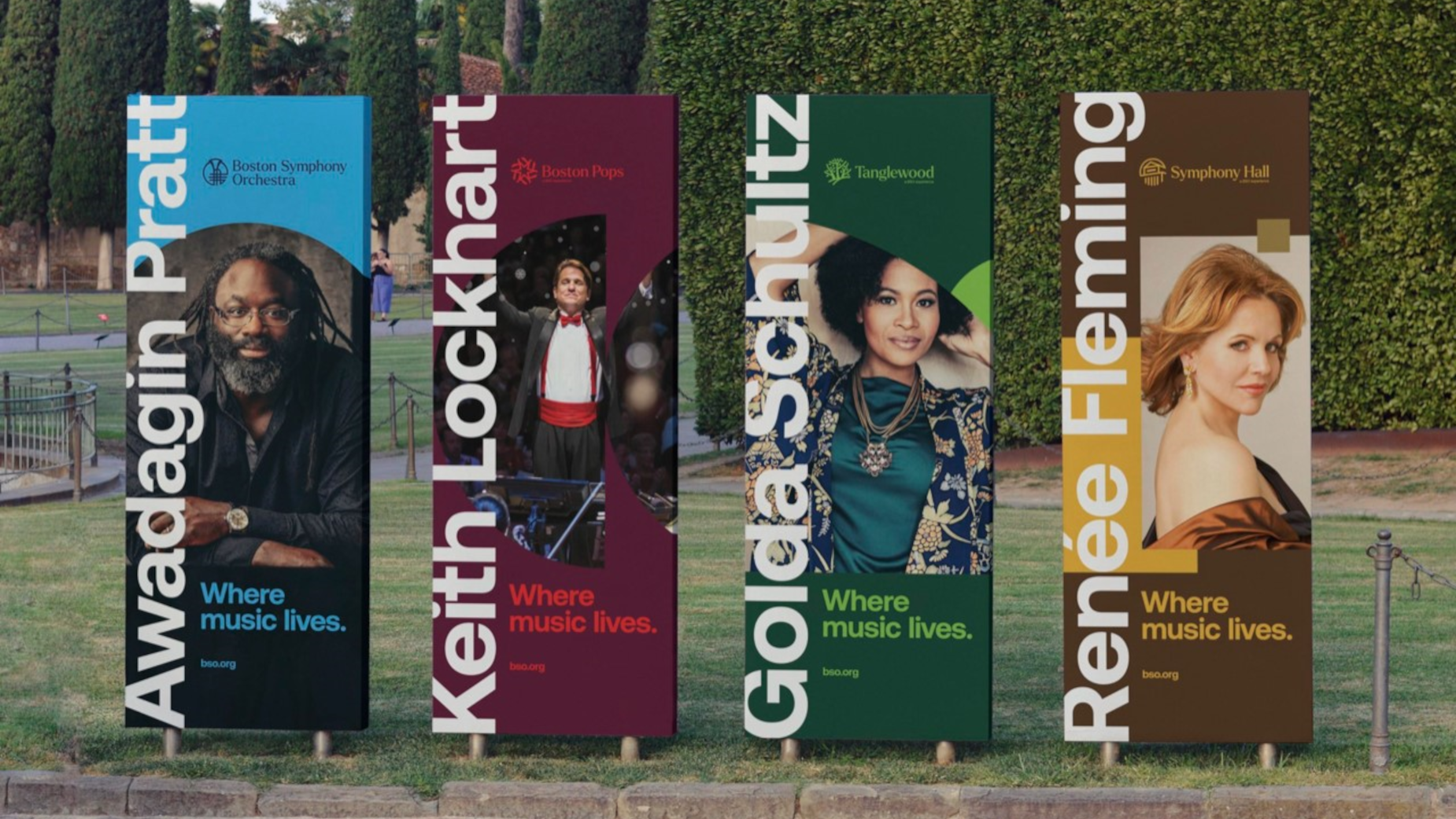
The new design is currently running across all touchpoints - the website, digital display, out-of- home, social, video, merchandise, print, owned and paid channels. The scope is international.
Founded in 1881, The Boston Symphony Orchestra is considered to be one of the Top 10 orchestras in the world. The prestigious institution has been led by great conductors including Erich Leinsdorf, Seiji Ozawa and its current Music Director Andris Nelsons, playing at its homes in Boston’s renowned Symphony Hall and at Tanglewood in the Berkshires of Western Massachusetts, as well as for audiences around the world.

With legendary maestros Arthur Fiedler, John Williams and now Keith Lockhart at the helm, The Boston Pops has recorded iconic film scores like Schindler’s List and has hosted music luminaries like Ella Fitzgerald, Ray Charles, and Aretha Franklin. Known as 'America’s Orchestra' the Pops are also known for their broad spectrum of music, as well as their iconic nationally televised, annual 4th of July Fireworks Spectacular on Boston’s Esplanade.
Tanglewood, the storied venue nestled in the rolling hills of Lenox, Massachusetts, has played host to musicians like Ringo Starr, Joni Mitchell, Elvis Costello, Jackson Browne, Bonnie Raitt, and Brandi Carlile and so many others. The pastoral, 500+-acre campus is the summer home of the BSO, as well as the Tanglewood Learning Institute and the Tanglewood Music Centre, one of the world’s premier music academies.
To convey its appeal to a new, modern culture, the BSO needed to redefine how best to express the incredible work of the institution. After all, much of its design system was first created in the late 1800s, the era of composer/conductor Johannes Brahms. To combat the frequent misperception that classical music is unapproachable, elitist and not for everyone, the brand worked to infuse modernity and make its products accessible to a broader audience, all while paying tribute to its rich history. It also wanted to raise awareness of the family of brands that the BSO includes, which have historically been perceived as independent.

“We wanted to preserve the BSO’s legacy and shake it up at the same time - inject some energy and put it on display for a new audience to appreciate,” explained Colossus’ Travis. “Classical music has long been perceived as only being reserved for elite, high falutin’ audiences. Our task as designers was to broaden the reach and appeal of this world-class orchestra and make it accessible to a younger, more diverse audience."
The new identity takes a modular, geometric approach using architectural elements as design influences. The BSO’s most prolific performances can be traced to three physical institutions- the historic Symphony Hall (McKim, Mead and White, Architects. 1900) in Boston, The Hatch Shell (Richard J. Hall, Architect. 1929) along the shore of the Charles River and The Koussevitzky Music Shed (Eliel Saarinen, Architect. 1938) at Tanglewood. By examining the notable form and contour of each structure, Colossus was able to create a unique geometric system to build upon.
A color-coded language was also created to distinguish the various brands: Blue for BSO, Red for Boston Pops, Green for Tanglewood (a primarily outdoor venue) and Gold for Symphony Hall.
Two harmonious typefaces were selected. Aeonik is a modern sans serif font with subtle angles and rounded geometry for maximum readability, while Larken is defined by sloping serifs, sharp wedges, and a nod to the sophistication of the performing arts. Together, they form a wonderful marriage of old and new.

Previous logos for the brand had evolved from Victorian-era engravings to a more corporate approach in the 1990s. The new logo set is now warm, approachable and modern. Above all, the four logos are now unified by using a consistent circular form and line width.
“When BSO was founded in 1881 with a vision of creating one of the finest orchestras in the world, room for innovation and evolution were left intentionally,” explained Jesse Needleman, the BSO’s Thomas G. Stemberg vice president, marketing, sales and communications. “Beethoven was most definitely not the end of the story for us - he was just a beginning.”
“We knew updating the brand identity of such a storied institution would be challenging, but we think it’s imperative that the look of our brands reflect our efforts to develop and offer programming that can engage broader audiences,” Jesse said. “We are excited that this new branding can help us open the doors of Symphony Hall and the gates of Tanglewood more widely than ever and connect as many people as possible with what we do.”


