Autochrome: By Order of the Peaky Blinders

As the cult drama
about the nation’s favourite Brummy gangsters draws to an epic third season
finale, we talk to Head of Colour at Time Based Arts, Simone Grattarola, about
the secrets behind the grade. After shooting to fame in 2013 for its gripping
narrative, brutal violence, and highly stylised cinematography, Peaky Blinders
has accrued notoriety and recognition across the world. As series three accelerates
us two years forward into the next stage of the Shelby empire, the drama has
not only moved on in time and narrative, but in style. LBB’s Phoebe Siggins
finds out more.
SPOILER ALERT:
Details of series three are revealed in this article.
LBB> The series has come such a long way from where it started, in terms of time period, wealth, and class. How has that affected the grade?
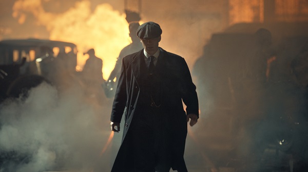
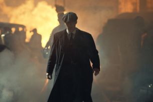
Simone Grattarola> The development of the narrative has of course influenced the overall aesthetics of the series in a big way. Although, as with any of the visual inspiration in Peaky, our starting place for the grade is always intrinsic to the past series. For the first series our references were deeply rooted in classic Western films like McCabe & Mrs Miller and Heaven’s Gate. The good thing is that the story still inhabits some of the old world, so that look stays, but as you say it has evolved. This series most definitely has a cleaner but more brutally bleak, quality to it. There’s a lot less of the smoke, heat and dirt which has happened naturally with the Shelby’s change in lifestyle.
There were some really interesting colour references that Laurie Rose, the DOP, brought on for the new series. Autochrome photographs were quite a big reference especially for the opening wedding scene. Autochrome was a forerunner to Kodachrome (a colour reversal film introduced by Eastman Kodak in 1935), which involved a more basic process of laying paint onto glass. It was quite an interesting look, much more painterly due to the process involved. We’d played around with them a bit before, but there were a few key specific references.
Above: Paddy Considine as Father John Hughes
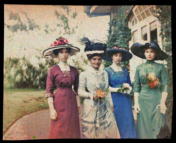
Above: One of the original autochrome references for the grade
LBB> So how
technically did you achieve that look with digital equipment?
SG> We used a method I’d worked on before, where you take a colour image and turn everything black and white. Then using a colour qualifier, I picked out the original colours. Through that colour qualification you can wash your own colour through, instead of bringing back the natural colour. This produces a similar effect to the colour washes they used on Autochrome. It creates a really interesting pastel aesthetic. It was quite nice to experiment and have something different in the series.
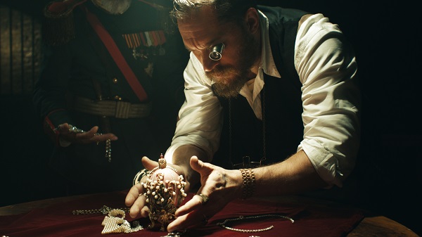
Above:Tom Hardy as Alfie Solomons
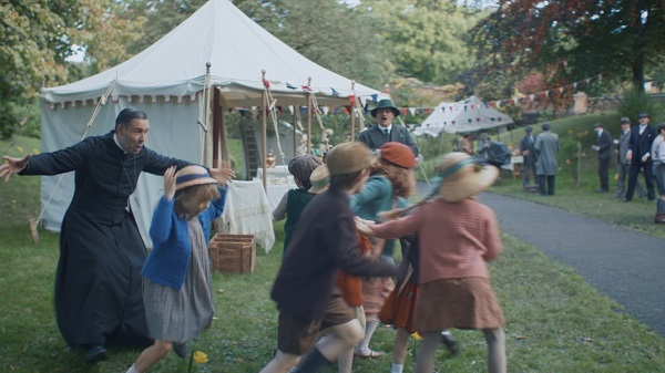
LBB> The time period in series three has added an interesting new dynamic. It has moved from post war depression into the roaring 20s where there’s a bit more money and a financial boom – which the Shelby’s are taking full advantage of. How did the nouveau riche family affect the visuals?
SG> You can really see
that shift in the art direction. There’s a lot more art deco and art nouveau
design in series three. There’s a striking difference in Ada’s house for
instance. In the last series she was just moving in, but now you can see she’s
made it her home. She’s an aspirational character so that played into the grade
but really your work is an extension of what’s happened on that art direction
and how the DOP has lit it.
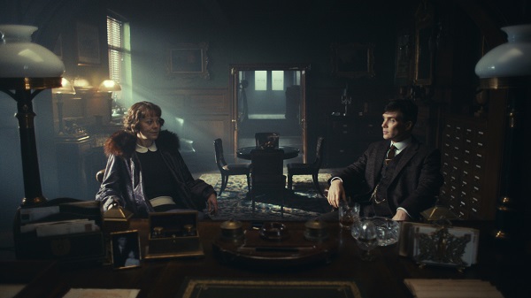
Above: Cillian Murphy and Helen McCrory as Thomas and Polly Shelby
LBB> You mentioned earlier that you used Spaghetti Westerns as a reference, are there any other films in particular that you looked at for this series to give it that bleak, cold look?
SG> The reference for this series was less specific to films. Interestingly
the first two series were heavily drug-influenced. Series one was opium and
series two, cocaine. My first question when it came to the inspiration behind
this series was, ‘what drug is it in series three?’. Actually, it’s not a drug at all but as the
series develops the theme becomes more about sex and lust. We didn’t actually
discuss any film referencing for series three. Tim was much more about the emotional
response to everything. He will push you to try things outside of your comfort
zone, so you open yourself up to this. We built some extra time into the start
of the series to experiment with different approaches.
LBB> Emotions run high in this series. Tommy’s new family has added a very different dynamic to his character. How did the atmosphere differ when he is with them?
SG> Colour is quite an emotional response. As the series develops, you start to get more of an insight into the mind of Tommy. We may not necessarily understand him but there’s a more intimate portrayal of his character. Fear, love and sadness become much more heightened. The scenes with his family tended to have a subtle soft atmosphere with warmer skin-tones and cleaner whites. There’s always a slightly more joyful aspect to him when he is with them. In episode three there’s a key scene where he’s with his son which cuts against a scene that’s very dark and bleak. It’s a very stark contrast. In terms of the grade, you’re driven by the narrative and that emotional response, really thinking about how you should be feeling at this point in the story. Tim [Mielants – Director] was always asking us, ‘how do we feel?’ It’s a good way to work. It became a lot more about that in this series.
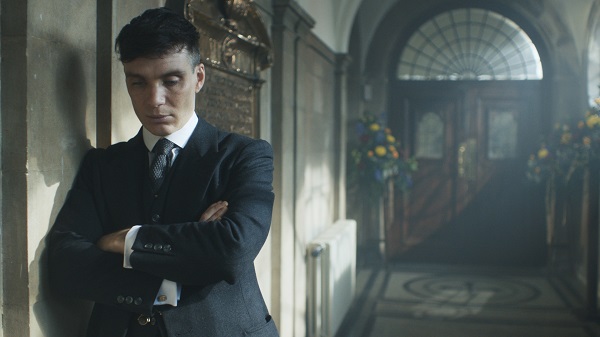
Above: Cillian Murphy as Thomas Shelby
LBB> There’s a new set of characters this series, the Petrovna family, (the Russians), the Grand Duke Leon Petrovna, his wife the Grand Duchess and the Princess Tatiana - the femme fatal. Did they have their own look?
SG> They most definitely had their own look. They are dangerous, manic, and a higher class than any of the antagonists we’ve seen before.
The director wanted the Grand Duke (Jan Bijvoet) to have a pallid ghostly look to him. This was achieved partly with makeup and partly with the grade. In every shot we were always making him paler than everyone else. There were a lot of moving grading masks on him.
The princess is most definitely a femme fatale and the Grand Duchess
becomes an important player. There’s a few shifts and twists along the way. Without
revealing too much, there is a key scene in episode two with the Duke and
Duchess where you find out it’s the Duchess who is pulling the strings. That
was a key scene to grade as it was shot in daylight but had to appear interior
night time to maintain continuity in the edit. The challenge for me was
ensuring it didn’t look too manipulated. You never want the grade to get in the
way of the narrative. It was tricky, but that was one I was particularly proud
of.
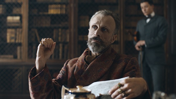
Above: Jan Bijvoet as Grand Duke Leon Petrovna
LBB> Having graded War & Peace, was that a useful reference point for the Russian side of Peaky?
SG> Funnily enough, even
though there are Russian characters in Peaky, they’re Russians in England if
you like, so they had to fit in with the Peaky world. There was a considered
look to the art direction, but it wasn’t like War & Peace. For that we used
many different studies including paintings of that time and specific Tarkovsky
polaroid images. All of those things were used to build up a very specific look
for War & Peace but it wasn’t approached in the same way to Peaky. There
was more of a feeling of what the Russians were, rather than something
culturally specific.
Above: Gaite Jansen as Princess Tatiana Petrovna
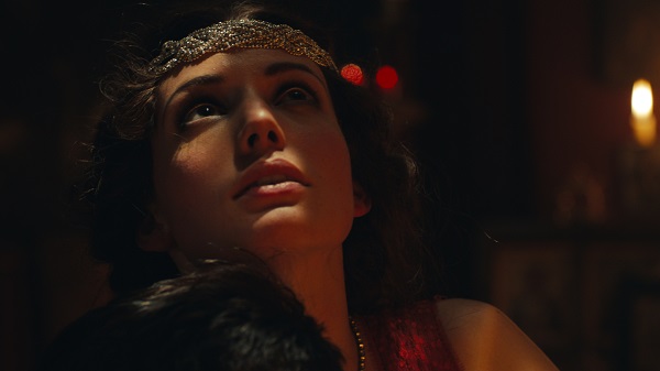
LBB> What were your favourite, scenes or frames to grade in the series?
SG> I’ve touched on the
wedding scene. That was one of my favourites and very stylised. The grade was
crucial here to help obscure the identity of the bride. You don’t know who he’s
marrying at first, so it was important that the viewer wouldn’t be able to
decipher the hair colour of the woman underneath, as that would have given the
game away. Initially you could see the colour was blonde, so with the grade I
tried to make it harder to interpret. However this also required some help from
the VFX team at Blue Bolt. They did a great job in making the veil bigger to
obscure the identity of the actress completely.
LBB> Other than the day-to-night scene you mentioned, what was the most challenging part of grading this series?
SG> With longform projects like this, time is always the biggest challenge. For each 60 minute episode, I’m given two days to grade it. However if you think about it in relation to the amount of time you have to grade a 60 second commercial, usually a whole day, it’s not a lot of time!
You have to apply a different way of working for longform. You have to
get into a different, broader mind set and accept that the grade will be less
specific than it would be in a commercial. However when you’re used to working
on commercials, you find you’re always discovering little bits you want to refine
more. I suppose the biggest challenge is getting it in a place where you
personally are happy, let alone anyone else. You’re always the harshest critic
of your own work! I have a good relationship with the team on Peaky so I’m
allowed a little more time if I need it.
LBB> You went to the premiere before the series launched. How did you find it?
SG> It was great. They actually did one in London and one in Birmingham, and I attended London. Funnily enough, I had to go to Berlin for two days to grade a job and I got to the premier with two minutes to spare. They were just about to turn the lights off. I was so worried I would miss it, as the BFI are notoriously strict with latecomers!
It was exciting as a lot of the cast were there and it was the first
time they’d seen the series on a big screen. There was also a select number of super-fans
invited, so you got to witness some amazing reactions from people. We graded
the series here at Time Based Arts and held our reviews in our full projection
suite. With Peaky, this was a great way to grade as we could see the
culmination of the aspirations we all had - about making something for a bigger
canvas - as we worked.