


A New Identity Marks Omelet’s 20th Anniversary

To celebrate its 20th anniversary, Omelet enlisted Studio Kiln to refresh its brand, creating an identity that better reflects who they are today and where they want to go in the future.
Kiln discovered a company culture that is deeply kind, caring, and creative. However, preconceived notions about Omelet’s name had been holding the agency back, limiting how it could express the many facets of its work and personality.
To centre Omelet’s playfully serious pursuit of new creative space, Kiln developed an identity built around a colourful, creative, and amorphous O.
The O represents the creative space that Omelet has fostered - one that challenges advertising norms, celebrates creativity, and encourages individuality.
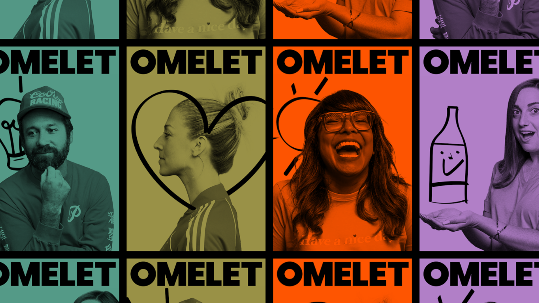
Set against a more formal and contemporary typographic identity in Poppins, the O creates a sense of confidence, pride, and structure. It remains an unusual presence throughout the identity - sometimes offering space for an irreverent statement, other times jostling for room with other elements on the page.

Omelet’s new brand identity positions it as a contemporary advertising agency that joyfully embraces its own unique idiosyncrasies.
No longer hamstrung by the light hearted nature of its name, Omelet now has the visual and verbal platform to authentically represent itself and its employees - with barely an egg in sight.


