


Panic Studio Partners with Truth Initiative to Give Gen Z Some Words to Quit By

Animation studio Panic has teamed up with Truth Initiative, America’s largest non-profit public health organisation, to drop a bold, snappy, animated campaign that supports gen z in quitting smoking and vaping for good.
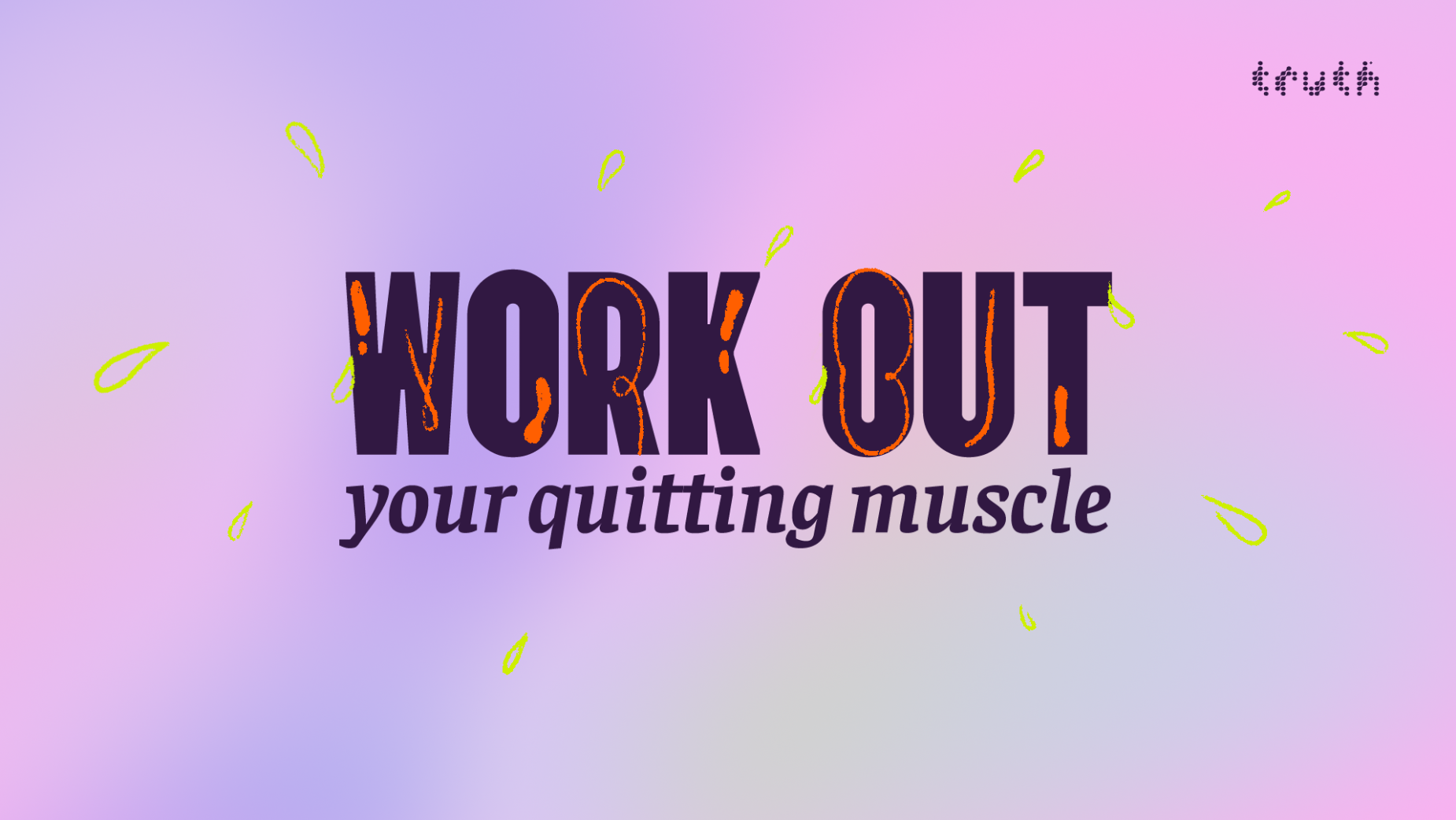
Across ten videos, ‘Words to Quit By’ acknowledges the challenges of breaking up with nicotine while casually busting myths and emphasising positive messages. The campaign speaks gen z’s language with bold visuals to capture their attention and emotional maturity that doesn’t preach, nag, or condescend (that means talking down to someone by the way).
Panic founder and creative director Gints Gutmanis said, “We knew that to reach gen z, we couldn’t be preachy or overly polished. The idea was to keep it simple with motivational phrases, almost like the posters you’d see on a bedroom wall. Then bring the words to life through animation, reflecting the real emotions people go through when trying to quit smoking: stress, anxiety, self-doubt, but also those moments of progress and victory.”
Short time. Tall order.
Each video had just ten to fifteen seconds to grab the viewers' attention, share crucial info, and leave a positive impact. Panic took on this challenge with their usual controlled chaos, mixing typefaces and emphasising key moments so the audience could grasp the message quickly from keywords alone. Even the skim readers and doom scrollers are not forgotten here. This naturally minimalistic design approach allowed the animations time to breathe despite their short run times.
Drawing out Emotions
Every letter, every font, every hand-drawn scribble that looks like a random squiggle, were meticulously planned to capture the viewer’s emotional journey—moving through self-doubt, vulnerability, and ultimately, landing on confidence and progress.
Each video may have a unique design setting, but there were common threads that tied the series together, from the holographic element present in each piece to the cool color palette used for backgrounds that allowed bright colors for emphasis. Meanwhile, Truth’s brand orange accented the first part of each video while becoming the CTA on the last frame. Utilising the brand colors in this way positioned Truth as a key pillar of support for the intended audience.


