


Your Shot: Using Animated Smartphones as a Metaphor for Alzheimer’s Effects
It was World Alzheimer’s Day a couple of weeks back and, inspired by a lack of understanding of the disease in Peru, McCann Lima and its client Entel looked to educate the public. In particular it was aimed at the younger generation. The result is a real ditty of an animated film in which a world is populated only by personified smartphones.
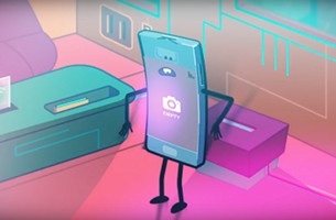
In the film we meet Matt - named after the Memory and Attention Test (MAT) which is performed to identify Alzheimer’s. As the story unfolds, he begins to experience more and more software glitches and data losses, as a metaphor for the effects of the disease. What’s more, Matt is based on the true story of Víctor Pizarro de los Santos, Colonel of the National Police in Peru. He was in perfect health until he was 75 years’ old, when he was diagnosed with Alzheimer’s. The gorgeous, 2D animation is the work of Buenos Aires-based Illusionario.
LBB’s Addison Capper spoke to McCann Lima creative VP Christian Caldwell and Illusionario co-founder Juan Pablo Figueroa to find out more.
LBB> What was the initial brief like and what were your initial thoughts when you saw it?
CC> The original client request was for us to create a new piece of content for Entel Clips, their platform which hosts content (not advertising) for their social media channels. However, we thought it would be interesting to not only entertain, but also educate the viewer, taking advantage of the fact that September is Alzheimer’s international month.
LBB> What kind of research and insight was involved? What were the most surprising facts you found?
CC> This year, in a very important meeting, a congressman from Peru said that Alzheimer’s was an illness caused by much reading and study. This obviously made international headlines; it showed that the knowledge in this country regarding the disease is really lacking. We therefore felt it was very important to educate the general population about what Alzheimer’s truly is, in a simple way, for everyone to understand.
Another important piece of information that we found was that, increasingly, there are cases of Alzheimer’s patients under 60 years old - that is not very usual. So, our main target was the younger generations, and our objective was to educate them on the symptoms and the changes they can make in their everyday life in order to delay the arrival of the illness.
LBB> Tell us about the idea of personifying a smartphone and using that as the metaphor - what inspired that? Obviously, there is the tie-in of Entel being a telecom company, but what else on top of that?
CC> When pondering how to educate on Alzheimer’s in a fun and straightforward way, we realised that all symptoms of the illness have a parallel when we think about smartphones. The cellphone is something that is vital to youngsters. They would hate to lose their data. Therefore, we believed that having a cellphone as a main character would engage the audience in a more efficient and emphatic way.
LBB> It must have been a tricky task to tow the line of this being a “cute” animation that would appeal to young people, but also ensuring that you had the core message and lessons within it. How did you pull that off?
CC> To achieve that we counted on the assistance of psychiatric doctor Mariella Guerra. She virtually guided us step by step, so that the shortcut would show the emotions and problems faced by an Alzheimer’s patient and the different stages of the illness.
LBB> The animation from Illusionario must have been really important here - what kind of conversations did you have with them? Why were they right for the job?
CC> Illusionario is an animation production house with whom we’ve been working for many years, and that we were confident would nail the craft and storytelling.
LBB> Juan-Pablo, what was your starting point when developing the film?
JPF> We started looking for visual style references that would adapt to the idea, always taking into account the reference sent by the agency. We tried to add our style as producers. It’s always good to find a particular style for each idea. That allows us to vary the style and to give each job its own identity.
LBB> Where did you look for inspiration with regards to the character design? Personifying smartphones must have been an interesting challenge - how did you go about instilling personality into them?
JPF> With regards to character design, we tried to look for simplicity, modernity and ensure that they could transmit a lot of emotion with their characteristics, taking into account that an action was going to take place on cell phone screens. One of the characters that inspired us is Beemo from Adventure Time.
LBB> With regards to the overall style and aesthetic, where did you look for inspiration?
JPF> The inspiration comes from the script analysis that we got and how to communicate the idea in an aesthetic way and in a short period of time. This job is a 2D vector style combined with an effects program, in which we use 3D cameras to get a depth of field that stands out of the piece in a 2D plan. We also used this style because of the time we had for production. In advertising, we generally have a shorter timeframe than in other cartoon production and we can’t sacrifice the quality of the idea and concept to communicate. Only three people were involved in the whole production.
LBB> As mentioned to Christian earlier, it must have been tricky to tow the line between being entertaining but educational – from a production standpoint, how did you pull it off?
JPF> It was very complicated and we think the final piece complies with it. We tried to be clear in the narration of the movie, we looked for an axonometric perspective where the plans are easy to interpret and they don’t impair the interpretation of the spectator. We tried to use pure lines, bright colours, simple and modern surroundings. Nowadays the spectator is in front of a piece of content for a short period of time, especially in social media, so if it’s not short, they don’t see it.
LBB> There is a wider campaign that surrounds the central film - can you tell us about that?
CC> The campaign itself included much more than just the short film. On the website www.ealz.pe people could find out about the real story on which the film was based - three real episodes of three stages of life of Mr Pizarro. While navigating, users could see that every problem faced by Matt in the short film was, indeed, a symptom suffered by Mr Pizarro.
Besides that, the PR awareness was amazing with four hours of broadcast in different national TV shows, in which the disease was talked about thanks to the short film. We also created MATT dummies, in partnership with Mr. Kat, a very famous Peruvian artist, that were auctioned online to people that answered a quiz via Facebook about the disease and the film.
LBB> I’ve always imagined that working on campaigns like this must be a particularly poignant process - would you agree with that? Why?
CC> It was a very moving process as we had to talk to Mr Pizarro’s family almost on a daily basis, so we could be sure we were clearly showing the problems he has faced since the disease diagnosis. When conversations as such take place, one starts to put him or herself in somebody else’s shoes, and it’s in this very moment that a campaign becomes more than just a brand advertisement.
JPF> When you work in animated projects, the whole process is wonderful, thrilling and funny. And if that spot has a charitable awareness and educative purpose it’s extremely rewarding. We are convinced that working with this purpose contributes a little grain of sand to enhance the world we live in.
LBB> What were the trickiest components and how did you overcome them?
CC> The most difficult part was to have the short film ready in time, as we presented the idea to the client at the beginning of August and the launch had to be during Alzheimer’s week (from the 18th to 22nd of September), so it was stressful to find an animation style that wouldn’t be as complex as 3D, but equally beautiful and attractive. We worked with three different companies from three different countries (soundtrack in Costa Rica, animation in Argentina, website programming in Peru), so that we could meet the deadline.
JPF> Actually working with Christian Caldwell and McCann is very easy; the briefs are clear, we are allowed to contribute ideas and they are very professional and kind people. The only delay was to find the general colour of the movie, which took several tests.


