


The Poster Creators Who Generated a Powerful Impact
Kabuki is one of Japan’s most celebrated forms traditional performance art.
With a history spanning more than 400 years, it remains an important part of Japanese culture.
However, there are an increasing number of Japanese people who do not know much about kabuki or have never seen a kabuki performance.
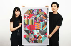
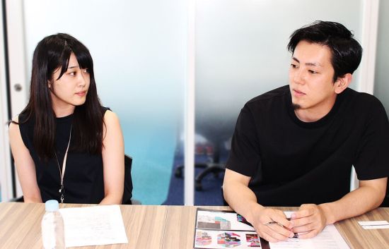
(Left: Marina Danjo, right:Yuki Tsutsumi)
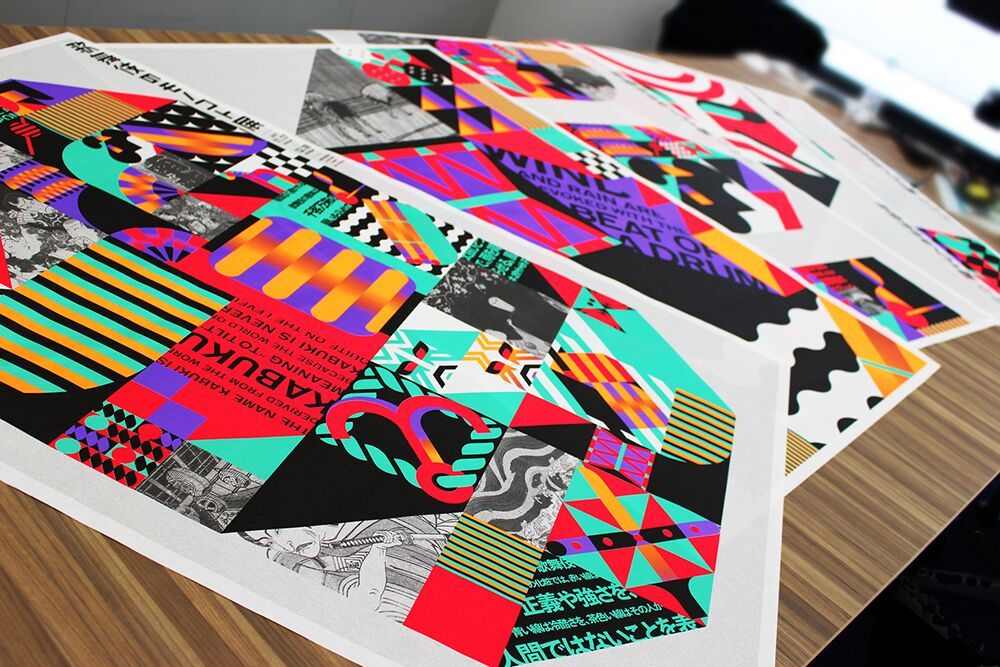
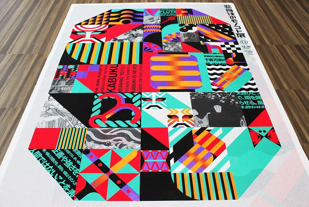
Many individuals and organisations keen to promote the appeal and greater understanding of the essence of Kabuki among the general public in Japan. As this movement began to build momentum, one series of posters produced last year gained particular attention. The posters were for the "Kabuki: Art & Artifacts Exhibition in Kyoto" —the centre of Japan’s traditional culture. While paying homage to traditions passed down over many generations, the posters condense bold use of colour and a very striking design. The posters’ creators commented that the finished work reflects their focus on the question, “What is the essence of kabuki?”
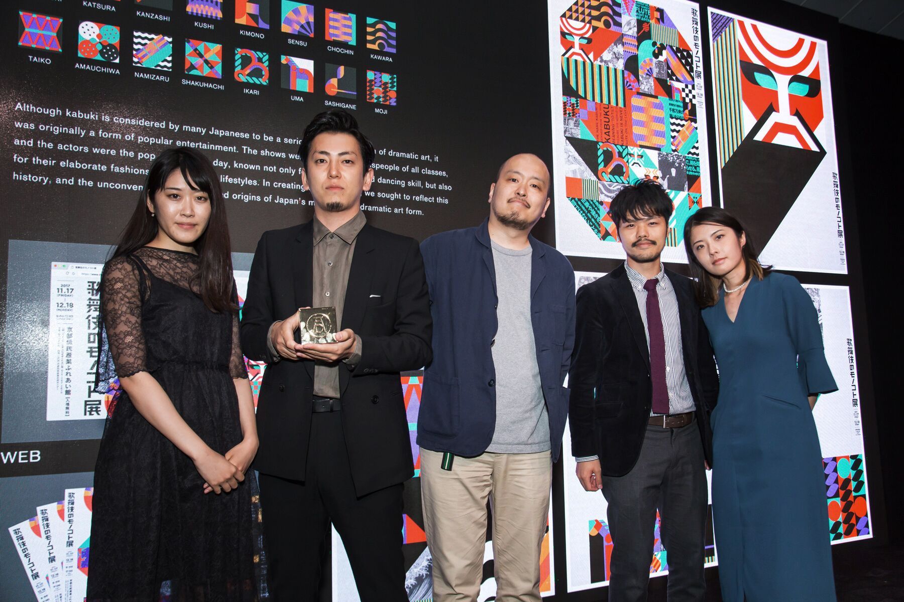
The posters have won several advertising awards, including a D&AD Yellow Pencil, and gold awards at ONESHOW and NYADC. Hence, the work has received significant international recognition. So how did it come about? We spoke to Art Director Yuki Tsutsumi (Dentsu Creative Planning Division 4) and Copy Writer Marina Danjo (Dentsu Creative Planning Division 2) to find out the inside story on the posters’ production.
The Overall Focal Point was the Original Mindset behind Kabuki
Q> The "Kabuki: Art & Artifacts Exhibition in Kyoto" posters have received high acclaim overseas, having won numerous international awards, including the D&AD Yellow Pencil. As the posters’ creators, how do you feel about this reaction?
Marina Danjo> Originally, when we set out to create these posters one of the key objectives we had in mind was to encourage interest among people who have little knowledge of kabuki. So from that perspective, we are happy that the posters have received recognition from people overseas who are less familiar with kabuki than Japanese people. I think it shows that we successfully communicated what we were aiming for. We are very grateful to the client, Minami-za, who took up the challenge of expressing this type of message.
Yuki Tsutsumi> Many of the comments we received from people overseas were along the lines of, “The posters are very emotional and powerful.” I was glad that even for viewers who have little knowledge of kabuki, they expressed interest in the poster and reacted to them.”
Q> What was the original background leading to the posters’ creation?
Danjo> Planning was underway for an exhibition called "Kabuki: Art & Artifacts Exhibition in Kyoto" to be held in November–December 2017. The exhibition was to focus on costumes, props and other equipment used in kabuki, and included the opportunity for visitors to participate in experiential workshops. The event organizer, Minami-za, asked us to create publicity materials for the exhibition.
Tsutsumi> Listening to the client briefing, it was clear that formalities and rules are regarded as important elements within kabuki as it is a traditional dramatic art form. On the other hand, we also felt that kabuki retains the image of having a high threshold for new audience members, and that this was one of the factors making it difficult to attract new enthusiasts. Based on this analysis, we wanted to create publicity materials that would attract the interest of new audience members, especially those who had until now felt that kabuki was something quite remote from them.
Q> And this client request is what led to the creation of the posters?
Tsutsumi> Yes, that’s right. Based on Creatrive Director Mr. Yoshihiro Yagi’s direction of the team, I was given responsibility for the overall design. Marina Danjo is a copy writer so naturally she was involved in producing the copy. But her role was not limited to that. She also came up with the overall concept for the posters, including the visuals.
Danjo> I am often given the role of producing a proposal for the overall direction and concept for a project. For this project, I decided on the focal point for the concept, and based on this Yuki Tsutsumi carried out the design.
Q> How did you go about deciding on the concept for the posters?
Danjo> No matter what kind of project I am working on, my personal work style involves initially doing my own background research on the field or sphere covered by the project. I did not have much previous knowledge about kabuki, so I began by actually going to see kabuki performances and reading books and magazine articles about kabuki. Within this process of acquiring knowledge of the genre, I thought, “What do we need to communicate about kabuki to stimulate the interest of people who don’t know much about it?”
As I studied more about kabuki, one of the things that left a lasting impression was the etymology of the word “kabuki.” Although there are many competing theories about where the word came from, many experts accept that the origin of the word is “kabuku.” This word has such nuances as, “defy accepted norms” and “the mindset of attempting to surprise.” Nowadays, kabuki is one of Japan’s leading forms of traditional dramatic art, but in the era when it first emerged, it was most likely regarded as a form of entertainment put on by people who dressed up in gaudy costumes and danced, and these people were probably seen as somewhat heretical.
So I saw this mindset of “kabuku”—of attempting to surprise the audience—as the essence of kabuki. I thought that if we could communicate this essence, we would be successful in attracting new interest in kabuki.
Tsutsumi> In the period when kabuki first emerged, the costumes and style of acting must have had a great impact. What if we were to try that in the modern era? That was the overall focal point for this series of posters.
Use of Colour and Titles All Underpinned by the Concept of “Kabuku” (Attempting to Surprise)
Q> So it’s clear that you began working on production after settling on the core concept. Mr. Tsutsumi, what aspects of the design did you particularly focus on?
Tsutsumi> Kabuki contains a myriad of elements, including costumes and props. The aim of the exhibition was to show these crafts lavishly. Hence, the elements of each poster were converted into icons, and a range of these elements were combined into the designs. However, we also wanted to express the mindset of “kabuku” within the design. One of the things I struggled with was trying to figure out what “kabuku” meant in a modern context, and particularly from the perspective of trying to generate a reaction from people who had been remote from kabuki until now.
Of course, we wanted to create impact among the posters’ audience without undermining the fundamental foundations of kabuki. Whether it was a color scheme or an icon, or the combination of these elements, in all these aspects our objective was to create a powerful impression. With regard to the execution of colors in particular, right up until the final stage of production—printing—we employed a process of trial and error.
This approach was also reflected the creation of the icons. For example, we didn’t express “kumadori” (the style of make-up worn by kabuki actors) in a straightforward way, but rather introduced design stylized elements to increase the impact. From the perspective of color schemes, we made the icons very colorful while using black-and-white photographs to create contrast.
Q> This attention to detail was probably one of the things about the posters that was appraised highly.
Tsutsumi> If that was the case, it’s very gratifying. Building up experience in attention to detail in production work is, I believe, one of the strengths of Japanese creative endeavors and crafts.
Q> One of the other interesting aspects of this series of posters was the title chosen, “Eating kabuki with your fingers.” This expression had both originality and impact. What kind of meanings were you trying to express through this title?
Danjo> As mentioned before, kabuki contains a diverse range of elements. We thought that a good analogy for this was the image of a bento (Japanese lunch box), which contains a myriad of food ingredients. Each of the icons used in the posters can be savoured as a whole or enjoyed for the detail packed into them—similar to how one may look at a packed bento box. That was one of the images we had when creating the posters. What the title implies is that the various elements of kabuki can be enjoyed by picking and choosing—which is where the connection with the finger food metaphor comes from. The idea was to create a link that would help to lower the threshold for gaining an interest in kabuki, and generate new interest in kabuki. One of the things I liked about this project was that the initial concept we chose was very bold and unwavering. It was significant that the title, copy and visuals all maintained a clear consistency with our production principles.
In my own work, at every stage of production I was able to return to our starting point to ask such questions as “What is the original purpose of this element?” and “Who is this aimed at?” I was pleased that we were able to produce something that did not become blurred through the process.
How the “Style of Not Deciding” Shapes Final Output
Q> Why did you feel that it was important to return to your original starting point?
Danjo> I believe that this is something necessary when one is trying to raise the level of quality. If one dives headlong into a task, what often happens is that one ends up in a different place to the original goal. I think it is important to always remain conscious of the concept and other essential aspects of a project.
While many decisions need to be made during the production process, these should be approached with due care. I tend to adopt a style in which decisions are subject to robust discussion. This is something that I have learned from Mr. Yagi, the team leader for this project, and other mentors I have worked with.
Tsutsumi> One of the particular characteristics of the team for this project was that things were often left undecided. Even if we discussed a specific matter in a meeting, in many cases we would deliberately not come to a final conclusion. Even if I submitted a design proposal, often it was not made clear if the design was OK or not. Early on, this was a source of anxiety, but as the project progressed I began to understand why things weren’t decided.
In other words, if something gets decided at an early stage, even if there is the later realization that it was wrong, it becomes impossible to go back. Conversely, if we come up with something that everyone thinks is good, we can build things up a little at a time while being able to choose from many options. Using this approach, at the very end we can click things into place, which means we are able to produce high-quality output that is faithful to our original concept. Once I understood this, I began to enjoy the style of “not deciding.”
Q>So maybe that way of working was one of the things that underpinned your ability to produce posters that did not waver from the initial concept.
Tsutsumi> Another reason was that, as mentioned earlier, Ms. Danjo came up with the concept and direction, including ideas for the visuals. The process was made easier because she sometimes wrote up visual ideas herself. The posters were a project in which the visuals were the key component, but she was involved in initiating the concept for those visuals.
Danjo> Personally, I like doing work like this where the design is the core element, and I was glad to be involved. That’s partly attributable to my background coming from a fine arts university. Some of the projects I work on are purely copy writing, but in projects like this one where the design is the lead component, much of my role encompasses such tasks as creating the design concept and coming up with the angle, in a broad sense.
Tsutsumi> In a design-driven project, inevitably the amount of text is small. Hence there are often cases in which it is difficult for the copy writer to receive much recognition. However, in the case of Ms. Danjo, she was involved in producing a concept that straddles the overall design, so I think it is good if she can receive recognition over a broad sphere. I think she is a relatively rare type in terms of copy writers.
Q> For you, Mr. Tsutsumi, what are the things you are particularly fastidious about when you work?
Tsutsumi> I like to have a clear view of how the audience will feel when they look at something I’ve made. For this project, I had the concept from Ms. Danjo to work from, and so put simply I focused on trying to create a powerful impression. I like to clarify in as simple a form as possible the way I want the audience to feel. If I don’t do that, it becomes quite difficult to realize my objective.
However, relying solely on one’s own intuition is no good, and I believe that objectivity is important. Consequently, I try to absorb the knowledge and experience of other team members. On this occasion, Ms. Danjo came up with the visual concept, so there were things within this that I could use as reference points. This enabled my output to become broader without simply relying on my own satisfaction. It made things very interesting.
Q> Finally, can I ask both of you to describe the type of creator that you aspire to in the future?
Tsutsumi> I want to become a person that can create durable designs. Nowadays, due to the influence of the online world, much attention tends to be paid to designs capable of attracting a very brief but powerful level of exposure. For example, designs that become viral on social media. However, to build a long-term brand, I think it is important to have durable designs that will be loved by audiences for a long time.
For example, I love the Dentsu logo. At first glance it is unlikely to become the center of attention, but one can see that much attention has gone into the detail. I think that those kinds of designs are loved over the long-term. In the future, I hope to have the opportunity to create designs that will last for a long time, such as logos for commercial facilities and buildings.
Danjo> As was the case with this project, I often work on projects within a team led by Mr. Yagi. In the future I would like to build a team like that of my own. As expression becomes more complex with the advance of digital technology, I think that it is better to bring together people possessing diverse expertise. The other team members will have knowledge that I do not have, but there will also be times when team members share a positive view on something. I believe that by building a team like that and by having core members in the team work together on many projects over an extended period, it will be possible to produce high-quality output.
To realize this goal, first I need to master my own specialist field. Without that, I cannot become a person able to demand this from others. In this way, I want to become a creator that can build a large team. In this too, I don’t want to decide the style of working too soon. As was the case with this project, I want develop ideas while discussing approaches with other team members.
At the NYADC award ceremony. From left, Marina Danjo, Yuki Tsutsumi, designer Mr. Odani of BAU Advertising Office, Mr. Take, and Ms. Hozawa.
Interviewees’ Profile
Yuki Tsutsumi
Art Director
Creative Planning Division 4
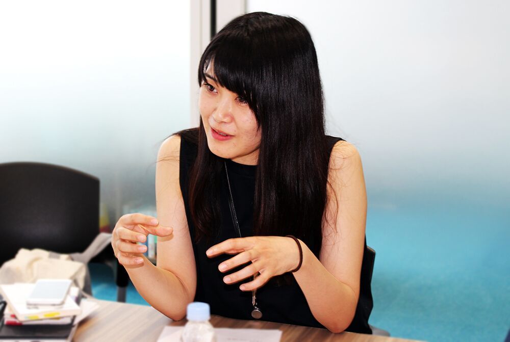
Marina Danjo
Copywriter
Creative Planning Division 2
Credit
Agency: Dentsu Inc.


