


The 4 Tricks to Creating Meaningful Infographics


In digital analytics, a field that
rewards rigor, there is a surprising dearth of standards. The lack of standards
is perpetuated by vendors and their proprietary metric names and extends to
marketing dashboards that seem hell-bent on concealing rather than revealing
what’s driving performance. A side benefit of this is that in digital analytics
we have leeway to report our data as “eye candy”, or infographics. There’s not
much standardisation when you are presenting data as pictures – but there is a
lot of fun.
With a design and engineering
background, I’d rather work in an emerging field like digital analytics where
creativity is embraced than in a field riddled with constraints and
regulations. However, I hate to waste time and think that standards save time.
So, I use four standard methods to effectively communicate metrics in
infographics. These methods are used to ensure the eye candy being created is
more akin to nature’s candy (e.g., fruit) than a shiny morsel that looks and
tastes good but leaves you with a toothache (e.g., gumdrop).
When I’m in an infographic frame of
mind, I’m thinking about sharing information that is bite-sized, sparse, thin
and shallow – an apple slice. I’m thinking about immediacy of understanding.
And then I choose from four methods for turning data into nature’s candy:
1.
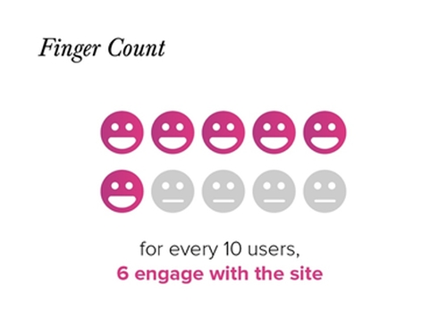
Finger Count
If my finding includes a percentage,
I use the finger count method to incorporate it into an infographic. For
example if your finding is: “Around 60 per cent of users engage with the
site.”
- Convert your percentage into
positive numeric values. Turn 60% into 60 out of 100.
- Convert values to a manageable
number of representative units. Make 60 out of 100 more manageable by converting
100 into 10 even units.
- Use a picture for each unit that represents
the users who do engage.
- Use a different picture for each unit
that represents the users who don’t
engage.
- Top it off with a clear and
concise caption.
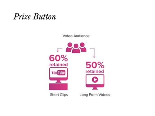
2. Prize Button
If my finding compares and contrasts
two numbers, I use the prize button method to incorporate it into an
infographic.
For example if your finding is: Video
is a popular content type regardless of platform. Short video clips posted on YouTube
have a 60 per cent audience retention rate while longer form ‘how to’ videos on
the website have a 50 per cent audience retention rate.
- Use your key findings, the 60 per
cent and 50 per cent figures, as emblems. Accompany with logos or graphic
elements as added illustration.
- Visually connect the two emblems
with a third emblem that represents their unifying characteristic. In this case
Video Audience, and use a clear graphic.
- Add text to clarify the relationship.
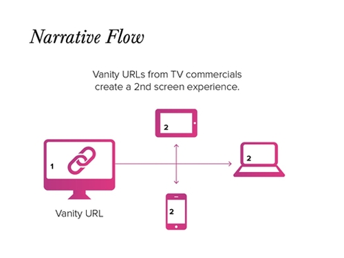
3.
Narrative Flow
If my finding is sequential, I use
the narrative flow method to incorporate it into an infographic. The
ideas is to show a progression or sequence.
For example: Vanity URLs used in
TV commercials create a second screen experience
- Choose an icon for each step in
the progression: Vanity URL, TV Commercial and Second Screen Experience.
- Use arrows to show a progression
from TV to Vanity URL to Second Screen.
- Add a clear caption or description
to clarify the relationship.
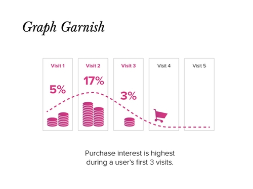
4. Graph Garnish
Finally, if my finding is best
represented as a trend, I use the graph garnish method to incorporate it
into an infographic.
For
example, if your finding is: Consumer purchase intent is highest on visit
two and is negligible after visit three
- Start by leveraging an existing
graph or template. The existing graph I used showed purchase intent spiking at
visit two and disappearing after visit three.
- Simplify the graph and highlight
the dominant pattern. Here the simplified graph truncates the number of visits
to five and removes the x and y axes.
- The graph is embellished with
coins and a shopping cart to reflect purchase intent
Of course, there are industry
organisations working on standards for digital analytics and I owe a great debt to
individuals in the field who put forth best practices for others to leverage. In fact,
the standards proposed above for more meaningful infographics are derivative.
But, as far as I can tell, though there are a billion blog posts on how to
create an infographic, there are not standards for how certain types of data
should manifest themselves in infographics. This has contributed to many a poor infographic where the meaning is sadly
sacrificed to the visual.
An infographic should enhance the
understanding of the data, not obscure it. You can quickly turn findings into
meaningful infographics following the methods described above. If enough
analysts adopt them, who knows, maybe finger count, prize button, narrative
flow and graph garnish will be the standards for the future generation of
digital analysts reporting with pictures.


