


Spooky Season Spectaculaire: Capturing the Aesthetic
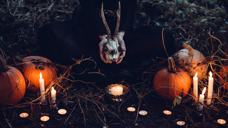
Ah, Halloween - the time when pumpkin guts are spilled for the sake of jack o’lantern art, costumes embracing the latest pop culture trends come out to play, and houses are decorated to the nines, inviting children to knock on doors while exclaiming ‘trick or treat!’. It’s an absolutely brilliant occasion, and one that is undoubtedly a cultural favourite for those privileged enough to celebrate safely.
But let’s take a moment to talk about aesthetics. Specifically, what lends Halloween much of its iconic nature are the visual trends that come out to play for the month of October. Cob-webbed haunted houses are found in abundance, inflatable monsters go up on the porch, and traditionally, the colours of orange and black can be seen just about everywhere… or so one might think.
If one is to look at the season’s advertising, there’s a lot going on. Sure, witches, skeletons, cats and bats are fun, but when you work in advertising, the (creative) world is your oyster. From art history to the scariest of horror movies - psychological and visually - nothing is off limits when it comes to providing inspiration for the ads we love in the spookiest month of the year.
To learn more about the gothic, spooky, weird and arcane, and celebrate Halloween 2023, LBB’s Josh Neufeldt sat down with some of the industry’s best to discuss their favourite Halloween art influences and looks.
Stephanie Sczublewski
Senior art director at TBWA\Chiat\Day LA
It's always struck me as fascinating how some of the deadliest creatures tend to be the most vibrant in terms of colour. There's a term for this in the animal kingdom - it's called aposematism. Basically, aposematism is how animals send out warning signals through their bright colours, like the poison dart frog, for example.
Now, you might be wondering what these frogs have to do with a Jack in the Box spot, but it's actually not that unexpected of a connection. We had the opportunity to team up with some of Hollywood's top horror writers to create an 8-minute short for Jack in the Box, and we used a similar strategy with colours to make the audience feel fear and unease.
Take red, for example. It's all about danger and blood, and it really cranks up the tension. You can see this come to life with our monster taco truck and the ‘Angry Monster Tacos’. Then there's black, which embodies the unknown and sinister, creating an air of mystery, especially in moments like when the bully’s hand reaches out to grab a taco.
We also played around with contrasting colours, like the stark mix of dark and light with our use of neon lights against a dark background to give that sense of foreboding. And let's not forget those unnatural shades, like sickly greens and blues which tap deep into our instincts of danger, which is why we cast an eerie blue hue over the whole film.
These colours act like warning signals in the world of cinema, alerting viewers to impending terror, much like how nature's creatures signal their toxicity through colour. It's intriguing how nature offers a lens for us to understand the psychological impact of colour in horror movies, both using striking and deliberate colour choices to sow fear and apprehension to their respective audiences.
Lucas Crigler
Creative director at SS+K
As a Halloween enthusiast, I can’t get enough of the goblins, ghouls, and guts. Yet, true horror, I believe, emerges from designs crafted to evoke a feeling of uneasiness - the sense something is just… off. When a piece of something familiar is reshaped or exaggerated, causing it to shift into a form that’s a mere imitation of its former self; as if from an alternate universe. That’s the stuff that makes my skin crawl.
Recently, I’ve delved into the dark underworld of fashion brand Balenciaga, for a similar mind-melting, emotional response. Demna Gvasalia, the brand’s designer, is a master at manipulating proportions and distorting silhouettes, inducing a glorious state of sick confusion. Elongated sleeves, oversized outerwear, and disproportionate accessories collectively create a twisted visual tension.
The infusion of unconventional materials like jet black latex and metallics amplifies the gothic aesthetic, while dystopian themes contribute to a disconcerting narrative only reminiscent of one’s darkest nightmares.
Balenciaga’s way of transforming fashion into a surreal experience profoundly challenges our perception of reality. Yet strangely, this mind-bending allure becomes irresistible, like a siren calling out in the night. One step closer, however, and I’m sure I’d go mad… Which is precisely why I love it.
Austin White
Art director at Dentsu Creative US
I love horror films with a surreal visual flavour. Two personal favourites are 'The Shining' and Dario Argento’s 'Suspiria', both of which our Dentsu Creative team took influence from for 'The Call' - Halloween work for Burger King. 'Suspiria' has such striking and disorienting lighting, with harsh reds contrasted against cooler tones. We wanted to bring that into the Burger King film as much as possible, while remaining true to the brand colours and identity. 'The Shining' brings a general sense of unease and suspense to the point that the viewer doesn’t even know what they’re scared of half the time, but they’re scared nonetheless. Our talent (Katherine Smith-Rodden) also reminded us of the film’s leading lady, Shelley Duvall, one of the many things we loved about her.
We explored numerous supernatural ways to bring the limited-time Ghost Pepper Whopper and Ghost Pepper Chicken Fries to life, such as appearing out of thin air and being engulfed in a literal ball of fire (see: 'Hereditary'). Ultimately, we settled on this otherworldly levitating sequence that felt equal parts surreal and camp.
Aesthetically, we wanted to pay homage to classic, vintage horror films. Everything in the film, from the TV set our scream queen's watching, to the car she drives, to the way she wears her hair, to the promotional film posters teasing the release, harkens back to a classic film era that younger generations are coming to love.
Matt Rogers
Creative director at Party Land
A lot of Party Land's work around deathly aesthetics has drawn reference from the familiar or joyful and turned it upside-down. There’s always a great tension in overplaying the familiar - giving the audience what they might expect, and then finding the perfect moment to flip the script.
When it comes to visuals, we find ourselves referencing a ton of death metal bands, from its logo work to their stage and costume design. The bands that do it well have such an incredible care for detail and narrative, which is inspiring. Lately, I’ve been fascinated with the tortured wood prints from the 1400-1500s. There’s something haunting in their depiction of the blatant disregard for life, yet the actual illustrations themselves are often hilarious. Thumb through some of those and you quickly realise where people’s creative efforts were focused back in the day, showing up to work every day thinking, ‘Hmmm I wonder if I can beat my last murder contraption, it just really did such a good job of providing death…’. Simpler times.
Mitch Fernandes
Art director at UNIT9
As an art director with a frightful passion for all things gothic, for me, Halloween is like Christmas - the peak celebration of the year.
Spooky season offers a huge source of inspiration for me; wild ideas without limitation, a window to a place where anything is possible. Inside that nightmarish dream world, I love finding references in films, TV, games and anime. For me, the allure of horror movies in particular lies in the ability to transport audiences by blurring the boundaries between reality and the supernatural. Horror movies offer a treasure trove of visual references - whether it’s hauntingly atmospheric environments, meticulously designed monsters, or heart-pounding cinematography, each frame can be a canvas of emotion and storytelling. Much like my design philosophy, they aim to create unforgettable experiences, etching memories into the minds of viewers. I love to create jumpscare moments in my work to do the same thing.
Recently, UNIT9 worked on a digital haunted mansion Halloween project for Fanta that allowed me to take some of these ghoulish ideas out of the grave and into my creative process. I was inspired by classic horror movies like ‘Nightmare on Elm Street’, added some personality with a nod to Tim Burton’s aesthetic style, and rounded it off with a touch of ‘Silent Hill’-esque tension to create an immersive and interactive horror experience that audiences can access through their smartphones (if they dare…)!
Rob Price
VFX supervisor at Zoic Studios
Dark inspiration is surprisingly easy to find in art! Many works are meant to create a sense of horror, but sometimes, it's only our modern perspective of the piece that introduces those feelings. I always think of the lighting first when creating anything, like the richly dark lighting of Caravaggio’s chiaroscuro style: using light and shadow to create small vignettes that are dark, moody, and sometimes deceptively violent.
I also love looking at surrealist works like that of Salvidor Dali; he takes us deep into the human mind and shows us how dark it is when we no longer have our reality to ground us. Fransisco Goya and his ‘Black Paintings’, or Francis Bacon in his ‘Screaming Pope’ series always leave me with an uneasy sense of dread I can't escape, so I visit those often.
Lastly, I look to old printmaking for a lot of symbolism and uneasy themes. There is a lot of casual death in early Germanic Renaissance art, like Albrecht Dürer, along with any old medical journal where it’s just as much an artistic impression of death as science explaining it. There are so many deathly themes in early print to borrow from.
Laurence Quinn
Creative director at Five by Five
Against the unsettling backdrop of a world fraught with its own terrors, I like to look at what recent horror-themed stimuli have given me the shivers, or more honestly, what I can steal.
The impact of the latest ‘Barbie’ movie on pop culture has elevated it to the top of the Google searches for Halloween costumes. ‘Stranger Things’ remains a popular source of ‘80s visual references, but the emergence of Wednesday Addams from the recent Netflix hit has propelled her Halloween costume to sixth place. The vivid, optimistic aesthetic characteristic of Barbie's world and wardrobe stands in stark contrast to the brooding, gothic demeanour emblematic of Wednesday Addams' distinctive style – the contrast captures the various sides of Halloween's charm.
A standout recent horror series that I can recommend is 'From’, crafted by the people behind ‘Lost’. It unfolds in a mysterious Midwest city ensnaring all who enter, weaving the struggles of unlikely residents striving to escape amid the threat of forest-dwelling shapeshifting, zombie-like entities. They are dressed in a range of different wardrobe options, from helpless old ladies to a milkman from the ‘50s. Its true-to-life aesthetics are more unnerving than that of graveyards and boogie men. See also ‘Yellow Jackets’, about a high school girls' soccer team who become the unlucky survivors of a plane crash deep in the Canadian wilderness. Then there’s ‘The Last of Us’, based on a video game about a hardened pandemic survivor who takes charge of a 14-year-old girl who may be humanity's last hope.
Another striking instance of real-life immersion that evokes a visceral sense of unease comes in the form of the upcoming PC game, 'Ready or Not’. Enlisting as members of the Los Suenos SWAT team in a dystopian urban landscape, players are confronted with the stark realities of poverty, civil unrest and looming terrorism. Drawing inspiration from the haunting visual style synonymous with David Fincher's 'Seven’, the game's art direction masterfully heightens its disquieting nature, delivering an immersive experience that lingers long after the screen fades to black.
Less recent is this Skittles film from 2017. While clients favour a lighter touch for Halloween, this spooky short film stands as an entertaining exception.


