How Guy Soulsby Created a Slice of Hollywood on a Shoestring
It’s that time of year when schmaltz and sentiment reign supreme – so what better way to blast yourself out of that mulled-wine fog than a devilishly dark mini-blockbuster?
Devil Makes Work is a modern twist on some ancient ideas: a fallen angel, forbidden fruit, fire, brimstone and eternal damnation. And this gothic horror may be a short film, but it’s not short on ambition. Despite being created on a shoestring budget, it has production values to rival the glossiest Hollywood feature. Indeed as Old Nick addresses the audiences from his junkyard throne and creates the ultimate filmic temptation – it leaves them wanting more. And that’s exactly what director Guy Soulsby had in mind.
He’s been developing the idea for a supernatural horror based on the Four Horsemen of the Apocalypse and Dante’s Inferno for some time – and decided to get the ball rolling with a more manageable short. What’s more, the short had to fit around Guy’s career as a busy commercials director (Park Village who represent Guy also helped produce the film) – which meant that at one point he found himself checking VFX progress whilst shooting at a Chinese water park, of all places.
“I knew that the script was not going to be possible due to its elaborate story, multiple characters, and the visual effects required, but more so the money and budget that’s needed to make a feature film. So I took aspects from it and developed a short that was more do-able – and when I say more do-able I look back and realise I was kidding myself, as it’s taken two years, multiple shoot days, an enormous amount of blagging, favours and a huge effort from over 100 people,” he says. “I want the film to be enjoyed, seen, shared and for people to talk about it. It is also somewhat of a ‘proof of concept’ short based on the feature film script; to jump into a feature film off the back of this would be great but I want to develop my skills further as a filmmaker before that opportunity even arises.”
But creating such a polished and atmospheric piece of film is no solo effort. Guy persuaded some of the ad industry’s best craftspeople to help him realise his hellish vision and to get their creative juices truly flowing.
“I think it was the possibility to create something not the norm, to make different worlds and to really push the boat out with production design, lighting, sound and visual effects. We all work in advertising and you don’t get a script that involves the devil, blowing up cars and having a witch surrounded by a blood oozing pentagram very often,” he says.
Production designer Noam Piper came on board to help Guy develop the visual identity of the film. Considering the range of ideas and influences involved, Noam had to bring together everything from African voodoo to Greek legend, modern graveyards and butcher’s shops.

“From the off, Guy had a few key visual references which he presented to me in a kind of mood board. Having worked together on a number of commercials prior to Devil Makes Work meant that we had already built a strong working rapport and he trusted me to develop some of his ideas,” says Noam. “I wanted to build on some of the core themes of the film – the timelessness and universality of Good and Evil – and I was keen not to set the film in any distinct time period or geographical place. Most of my research was focussed on blending Eastern and Western Worlds; I looked into a lot of photography from around the World; Remote Afghan & Pakistani villages, Haitian Voodoo customs as well as old Iranian brothels. The photography of Kaveh Golestan was particularly inspirational.”
If Noam’s creations built the world of Devil Makes Work, perhaps then it’s the demonic monsters within that bring it to life. Prosthetics specialist Robbie Drake helped created a gruesome demon revelling in a gory torture chamber-come-stainless steel butchery. Robbie used a head cast of the performer to create prosthetics for the face and ears. “The whole concept of the film fascinated me and Guy sounded so excited about the whole thing; it was that enthusiasm that made me want to be involved.”
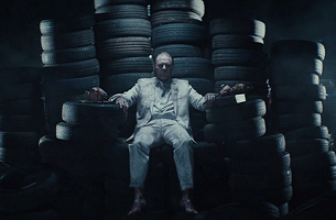
The real star of the show, inevitably, is Lucifer himself. Guy describes his vision for Satan as an intimidating ‘alpha male’ – and with his slicked-back hair and grubby white suit, actor Shaun Dooley brought the grit of a British gangster flick to the world’s most iconic bad guy.
“Shaun was amazing and I can’t thank him enough for coming on board and being part of the film,” enthuses Guy. “He loves this genre, which helped a great deal. He became the devil and fully committed to this alpha male, sinister human form of Beelzebub. There were moments before shouting ‘action’ that Shaun would get into character, grunting, gritting his teeth, breathing heavily and staring ahead into the dark as if it were someone he wanted to punch in the face, all of which was pretty terrifying bearing in mind he’s covered in blood sat on a throne of tyres in a desolate scrapyard at night. The proof is all on screen, he nailed it!”
The character underwent quite a transformation before he made it onto screen. Guy’s initial idea for the devil was a ‘scruff in an East London caff’ – and that’s the vision he still has for his full feature – and costume ideas eventually evolved from vampiric black to brash white.

Helping Guy to bring his vision to life was producer Pete Ryan, who was convinced that this would be no usual short. “His enthusiasm and passion were the backbone of this project and after seeing the huge amount of work he had put into the concept I was confident we were in a good place. I was, however, still a little concerned, as any producer would be, with the budget or lack of, as the goal was very ambitious. However, Guy's meticulous planning and careful attention to detail to the script, boards and visuals, combined with the fact that we didn’t have to contend with the normal limitations of a commercial piece of work did give us more scope to work with. Guy was also determined not to compromise his creative or the production values and this perseverance drove everyone that little bit harder and the results are evident on screen.”
And that perseverance was crucial when the team shot their trickiest and most trying sequences, in a junkyard in Luton. It was a 30-hour day, involved shooting actor Shaun Dooley on his magnificent throne of tyres and, err, blowing up a car.
“Pete Ryan (producer) and myself must have contacted every single yard in London and just outside the M25,” recalls Guy. “The guys near Luton were the only ones that gave us access and allowed us to blow up a car. A huge benefit was that the local fire brigade trained there, performing car rescues and mock crashes, so they came down when we did the burn. Of course if a real fire were called in they would have had to leave but luckily no one dialled 999 that night. The day ended up being over 30 hours for Pete, and myself from getting up to getting back to bed. It was the longest shoot day I have ever had. Our final shot was captured as the sun rose on the horizon. I was buzzing so much once I got home it was actually hard to sleep, I was still up around 1pm the next day looking at the rushes until I had to take myself to bed.”
Thankfully, Guy also had DOP Nicholas Bennett involved, whose decision to shoot on anamorphic lenses and embrace a bold stylised look throughout provided the key cinematic stepping stone to crafting a miniature feature. After the shots were captured, it was down to the dream team of UNIT, ENVY, MPC and SNK Studios to add the blockbuster spark.
One of the most dramatic scenes in the film sees Sisyphus, one of the unfortunate damned of Greek mythology, pushing his boulder ever upwards. For UNIT and Guy it involved a lot of consideration in order to get the big movie feel.
“The shot was built up using a series of stills projected onto cards and offset in z space in Nuke’s powerful 3D environment, so that when we add a camera movement to the scene we get a nice parallax and can adjust the depth of field and motion blur in order to add a more realistic feel to the shot. This method along with added atmospheric elements really brought the still image to life. This also gave us freedom to adjust the camera without affecting the workflow of the comp,” explain the team at UNIT. “An example of one of the challenges we faced was making the boulder feel as though it was moving and resisting against Sisyphus' strength. Sisyphus does not move a great deal on the plate so we had to warp him and in sync move the boulder to give the impression the two were moving together. An added touch to the illusion was footage of dirt crumbling on the floor, which was actually taken from another of Guy's shots.”
Envy’s Nick Armstrong cut the film – a process that was somewhat drawn thanks to a shooting schedule that had to accommodate the crews’ day jobs. However a strong sense of tone and pace from the off and Guy’s clarity of vision meant that the edit was consistent and clear. What’s more, Guy and Nick’s commercial experience also came into play and helped them ensure an efficient mode of storytelling. “We are huge short film fans and have seen so many but a lot of them can meander on too long and get self-indulgent. We decided early on that a vivid high impact approach to storytelling would be better and make the film stand out,” explains Nick. “Guy obviously does this regularly on commercials with huge emotional impact so why not harness this approach into a short film?”
One of the most striking elements of the finished film is that the visuals are as intensely dark as the content. That’s partly thanks to MPC colourist George K, who encouraged a ‘go hard or go home’ approach with the colour.

There was no specific reference for the grade, though films like David Fincher’s Se7en and Alan Parker’s Angel Heart did crop up in conversation. “Given the subject matter we were always going to make it look dark and sinister. The question was – how dark? We had a lot of discussions around pushing the image too far. Guy spent a lot of time making the set look right so he wanted to retain as much of that detail as possible. The film needed to be dark and brave with how deep the blacks would go. We had some nice deep reds that I knew would complement the deep blacks and make the image feel richer. Guy trusted what we were doing, and we were all pleased with the end results,” says George, who also added that Nicholas Bennett’s lush cinematography provided a brilliant springboard for a truly filmic atmosphere.
The final piece of the blockbuster jigsaw was music and sound from SNK Studios which – as anyone who gets to see the film in a cinema setting – adds just the right level of Hollywood bombast. The team jumped at the chance to flex their creative muscles and delve into the world of horror – word has it that a lot of fun was had with discordant violins. “The film is non-stop drama, so the sound needed to embrace that,” explains Seb Juliver of SNK. “We wanted to create a flow from one scene to the next, so it feels like part of a whole narrative, whilst at the same time giving appropriate character to each individual scene. There was a huge amount of work done to build up the audio layers – music (myself) and sound design (Rob Baker) were produced simultaneously, so they work as part of the same landscape – not fighting or overcrowding, but complimenting each other. I think these production values give the sound that polished 'Hollywood' feel Guy wanted to achieve.”

The devil, they say, is in the detail and it’s a cliché that was taken to heart throughout the production process. It has been the key to keeping quality high – and even as he neared the end of the process he was keen to push through some particularly effective finishing touches. In a smart twist of thinking, Soulsby ends the film with a credits sequence that feels like the titles for a feature or an HBO series. It leaves audiences feeling like they’ve just witnessed the introduction to something far bigger.
“I was keen to add a little something extra and with the feature film approach in mind I wanted to include a creative way of showing as many key contributors names as possible,” explains Guy. “I really like the way this has been done in Iron Man, Sherlock Holmes and 300. So I worked with the guys at FOUND to design the end credits. These took some time, as we needed to hit the right look and tone, making sure they were in keeping with the film. Of course, yes, I hope you leave wanting to see more, that it’s ‘whet your appetite’ as they say; a number of people said the same thing when we screened the film at Framestore, which was very pleasing to hear.”
And the LBB team can confirm that it’s pretty tantalising. If you’re tempted, find out more by heading to devilmakeswork.com. The film will be doing the festival circuit in 2015 and the site will be updated soon to allow people to watch it online (though, as ever, a proper cinema screening is a far more immersive experience). And let’s hope that the Faustian pact with Hollywood comes soon – we can’t wait to see more of Guy’s silver screen vision of hell.


