


How Bowmore Leapt Through the Dragon’s Gate for Lunar New Year
Coming off the back of an award-winning 2023 campaign for their Lunar New Year special edition, Beam Suntory is back again in 2024. In collaboration with Leo Burnett Singapore, Beam Suntory unveiled their 2024 special edition packaging for Bowmore Islay Single Malt Scotch Whiskey.
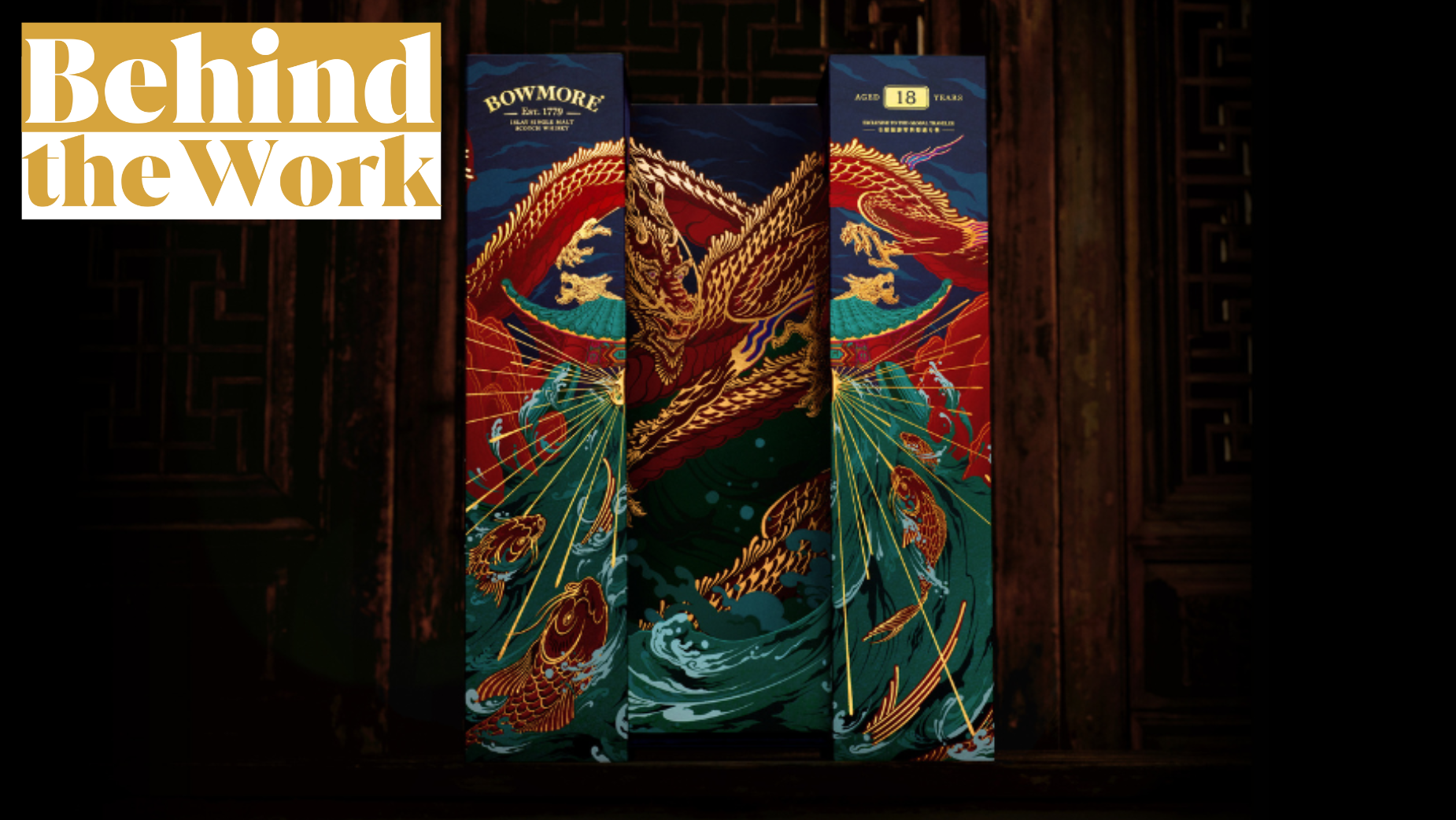
Embodying the spirit of resilience and transformation symbolised by the Year of the Dragon, the packaging features the journey of a determined carp evolving into a majestic dragon. According to Sharim Gubbels, ECD at Leo Burnett Singapore, the carp's story parallels Bowmore's legacy of perseverance and dedication to craftsmanship over its 240-year history.
LBB also spoke to Janath Gamage, senior art director, and Ravindu Wilegoda, senior copywriter, from Leo Burnett Singapore. Together, the creative team offers insight into the creative process behind Bowmore's Year of the Dragon limited edition packaging, inspired by the Chinese proverb "鲤鱼跳龙门" (the carp has leapt through the Dragon’s Gate).
LBB> How did the creative team at Leo Burnett Singapore decide on this particular legend and proverb to represent Bowmore's journey?
Sharim> In the scotch whisky world, Bowmore is regarded as a master of the craft. In Chinese culture, the character of the Dragon is often used to symbolise a master. As we delved into Chinese folklore, we found the perfect parallel to Bowmore’s pursuit of excellence in the tale of the carp and the dragon. The proverb is very well known and echoes the same wisdom that has guided the distillery for over two centuries: that greatness belongs to those who persevere.
LBB> The packaging design tells a story and incorporates a mechanism that reveals the transformation from a carp to a dragon. Can you elaborate on the design process and the significance of this mechanism in conveying Bowmore's journey to greatness?
Janath> Like most great stories, this legend of the carp and the dragon can also be broken down into three acts: the carp’s perilous ascent up a waterfall, its final leap over the Dragon’s Gate, resulting in a miraculous transformation, and the triumphant dragon that emerges at the end of the journey.
When we mapped out the consumer’s unboxing experience, we found that we could break it down into three parts as well: the closed pack, the opening mechanism, and the interior of the pack. We began by depicting the story of the carp’s ascent on the pack exterior. We captured the second act of transformation by designing a packing mechanism that slides open to reveal the final part of the story. To capture the triumphant third act, we devoted the entire interior of our pack to display the majestic dragon in its full glory.
LBB> An original spring couplet on the back of the box adds a traditional touch to the packaging. What role does it play in enhancing the storytelling aspect of the campaign?
Ravindu> Writing and hanging spring couplets are a vital tradition during the Lunar New Year – one that is still widely practised today. A spring couplet is perfectly suited to telling the story of the carp and the dragon for a number of reasons. The poetic structure of a couplet is typically two lines, with each individual character offering a contrasting meaning to another on the opposing line. This helped us segment our story into two parts, with one line of the couplet representing the carp’s journey and the other representing the dragon. The couplet also complements the opening mechanism of our pack, where the back panels separate from the middle, mirroring how spring couplets are typically hung on either side of a doorway or entrance.
Once we composed the couplet, striking a fine balance between describing the story and conveying its moral, we moved into the design phase. Here, we enlisted the help of our own junior art director, Nicholas Leong, who manually crafted the typography in hand-drawn calligraphy. After many rounds of style explorations and iterations, we finally locked down a more traditionally inclined style while giving each stroke a unique touch inspired by the fluid motions of water droplets. Once the hand-drawn calligraphy was complete, we converted it into a digital format and refined it further to ensure it remained legible against our illustration.
LBB> The 2023 special edition packaging received recognition from the World Brand Design Society and New York Festivals Advertising Awards. Were there lessons learned from the previous edition's reception?
Sharim> We learned a great deal from the recognition we received for last year’s pack at various design-centric awards shows. On surveying other competing entries, our biggest lesson was to pay the most attention to the depth of the underlying concept and the authenticity of design to the source inspiration. This fuelled us to be more meticulous with our cultural research and more rigorous with our design consistency.
Before we delved into the visual and design aspect of this project, we first established a firm conceptual foundation, allowing us to anchor our storytelling with a consistent narrative thread running through every single discipline: illustration, pack design, typography design, brand messaging, detailing etc. Every detail and decision was highly intentional, drawing from historical sources, traditional Chinese art styles and cultural traditions.
LBB> Bowmore has a rich legacy of over 240 years. How did you ensure that the storytelling in the packaging resonates with both the brand's historical significance and the cultural context of the Lunar New Year?
Janath> The secret behind Bowmore’s hard-won success has always been perseverance and determination. To introduce the story of Bowmore to Asian markets that are not as familiar with the brand’s history, we chose a story that reflects both the brand's values and echoes the sentiment of the occasion.
The Year of the Dragon is considered the most auspicious year in the Chinese Zodiac and represents power, good fortune, and success. It’s regarded as an opportune year for new ventures and pursuits, making the lesson in the tale of the carp and the dragon more relevant than ever. Throughout our storytelling, visually and through our pack messaging, we pay homage to the spirit of perseverance behind Bowmore’s pursuit of excellence, while delivering a timeless piece of wisdom to all those seeking greatness in this auspicious year.
LBB> The packaging tells a story and embodies a sense of resilience and determination. How does this thematic choice align with Bowmore's values and commitment to handcrafted whisky?
Ravindu> Looking back on Bowmore’s history, we discovered an iron-willed character, as seen by the distillery’s commitment to upholding the traditions of scotch whisky and preserving the art of handcrafting to this day. This unwavering determination has been the guiding force behind the brand’s success and our inspiration for choosing the tale of the carp and the dragon.
The storytelling of our packaging is meant to convey the transformative power of resilience, echoed both in the timeless tale of the carp’s ascent and in the story of Bowmore’s transformation from a humble distillery to a world-renowned craftsman.
LBB> With the Lunar New Year approaching, how do you anticipate the limited-edition packaging contributing to Bowmore's visibility and resonance, especially in regions where exclusive bottles are available?
Sharim> Asian markets have been one of the fastest-growing market segments for single malt whisky, as seen by many scotch brands continuing to release limited editions during the festive season. In order to tell a captivating story amidst this competition, we prioritised authenticity and cultural relevance over superficial visual appeal. By blending the tale of this Scottish scotch maker’s pursuit of excellence with an enduring Chinese legend, we wanted to tell a meaningful story that both captures the spirit of the occasion and the essence of the brand – a story that reflects the hopeful and ambitious nature of the Year of the Dragon.


