


Neon Nightmare Cuts to Emotional Core of Plastic Pollution Crisis
Plastic detritus clogging up the ocean, creating artificial islands and murdering wildlife, entering the food chain – it’s an issue that has reached crisis point. News reports and social media campaigns are inescapable and it has become apparent that humanity needs to change its ways or risk suffocating the seas and strangling biodiversity.
But, humans being humans, the impact of repeat pictures of dirty beaches and strange plastic islands soon diminished. In order to cut through the white noise and motivate real change, the team at marine conservation organisation Sea Shepherd needed to put something out with a visceral, emotional wallop.
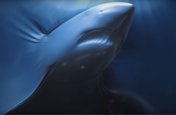
Agency Fred & Farid and production company Alkemy X have created a beautiful yet horrific campaign that depicts sea creature pushing – and soon struggling with – neon plastic sheeting. Of course, no animals were harmed in this carefully crafted CG spot, but the stylised depictions of suffocation are truly disturbing and impossible to ignore.
LBB’s Laura Swinton caught up with Alkemy X creative director Geoff Bailey.
LBB> What were your initial thoughts when you saw the creative idea?
GB> Excitement. Wonder. And fear.
Excitement that we would have the opportunity to work on a project that might play a small part in making the world a better place. Clearly, we are at a moment in our planet's history when everyone needs to step up and act.
Wonder at the possibilities of creating something that spoke to the heart, not just the head. From the beginning, Michael [Hess, associate creative director at Fred & Farid] and I were in agreement that we want to do something different. For the majority out there (there is, of course, a vocal minority who disagrees), the problem isn't that we don't know that environmental destruction is a problem. Another PSA telling us how terrible the world is wasn't going to make someone decide that the time to act was now. We wanted to engage their emotions as well as their intellect.
And fear, trying to figure out how we would build a narrative around the idea and get the plastic material to behave in a way that, ultimately, had to feel slightly surreal without losing the quality of plastic. But I really believe that if you're not a little scared at the beginning of a project, then you're just resting on your laurels.
LBB> And when developing the look of the animals trapped in plastic, what sort of research did you do? I imagine that there are loads of directions you could have gone down - transparent plastic etc. - so how did you land on this look?
GB> The material had to do a lot of things at once: it had to react smoothly enough in the early shots to let the animals move underneath it, but still stretch like plastic; it had to produce shapes that were elegant and refined, but also reveal the fine details of the creatures below or else you lost the emotional connection with the animals. We did tons of research upfront, breaking our team into two: one section did look dev on things like colour, translucency, lighting, etc.; and the other focused on the plastic simulations. We spent a lot time playing with different types of plastic— from latex to plastic wrap — to understand how they behaved. All of that was useful, but in the end we had to push the physical simulations to a place where they no longer behaved like real materials. We found something that felt like a surreal combination of water and plastic.
LBB> From a technical point of view, what were the key challenges?
GB> The biggest challenge was developing a simulation that created the sharp creases and stretches that you associate with how plastic behaves under tension, and also showed the fine details in the face and flippers of the animals. We moved through a few software packages before moving quickly into Houdini. Our FX lead on the project, Brendan Fitzgerald, did an amazing job of developing a technique that combined the physical simulations with post processes that then tightened the material to itself and the 3D animals giving us all the additional detail. Imagine a CG combination of flowing plastic and a vacuum packer that then sucks the material tight to itself and the animals.
But the biggest challenge is always putting all of these technical details in the service of a story and creating an emotional reaction in an audience. Overcoming all the other challenges is really in the service of solving that one.
LBB> The colour is so eye-catching but it also captures that rainbow sheen that you get on oil slicks etc. How did you figure out the colour palette?
GB> That was a real collaboration between Michael and myself. Michael really wanted the first few shots to be more colourful, to feel like works of art, before transitioning in the later shots to the blue colour palette that the viewer would firmly understand as being underwater. The big challenge was creating that transition without losing a cohesive colour palette across the entire spot.
To do it, Michael and I would just pass files back and forth, from the earliest look development tests to the final colour adjustments. I'd work up tests, he'd push the colour one way, I'd pull in another and, eventually, we found the right balance. But that level of back and forth was possible because we were both going for the same effect.
LBB> The film and print manages to be both beautiful and deeply disturbing - was that a tricky balance to get right?
GB> Absolutely. That was the conversation at every stage of this job, from look development, through edit, animation, and colour. In the film we want to transition from a world what was beautiful and balletic to one that was profoundly disturbing. The contrast would make both more meaningful. I think our early edits were too heavy on the disturbing side and we had to pull the beginning of the piece in a very different direction. But those are the discoveries you make along the way on any project.
LBB> I think what I personally really like is that at a time when plastic in the oceans is becoming such a major issue you've found a way to visually communicate it in a way that I haven't seen before and which might get through to people who might tune out the more typical images of turtles and plastic bags. How important was the idea of creating visual cut through?
GB> I believe that it's emotion as much as intellect that drives people to stand up and try to make a change in their world. We're bombarded with information and images. These past weeks saw the release of new studies that show that pollution of our environment is increasing at a terrifying rate. And videos of divers swimming through the plastic islands in the Pacific, which now cover an area larger than Mexico. And all of that is crucial. Our spot is a small piece of this larger discussion and we wanted to take a different direction. We're all looking for new and different ways to reach more people, to reach different people, and to make the same argument in different ways. But we're all pushing in the same direction: change.


