


Louder Than Words: The Art Of Music Video Typography

For many in the industry, creativity is its own reward. There’s an endless curiosity that drives creative passions, and it can manifest itself in ways we may never have previously imagined. For Nice Shoes’ creative director Stefan Woronko, his passion finds itself applied to a simultaneously niche, yet enormous talent - music video typography.
Stefan’s work has contributed to smash hits from Drake, Justin Bieber, Usher, Coldplay, and many more. A mathematician could probably work out the sheer number of people who’ve seen and enjoyed Stefan’s typography - but we struggle to count into the billions.
Having started his career in fashion design, Stefan quickly discovered he had a passion - and a talent - for crafting a visual identity for brands. The artist has since been able to apply that talent to sports (he’s designed in-arena playoff packages for the Toronto Raptors as well as animations for Toronto FC). Next up was music videos, a field in which it’s fair to say Stefan has cemented an excellent reputation.
To catch up with Stefan and go behind the scenes on projects with some of the biggest artists in the world, LBB spoke to the Nice Shoes CD…
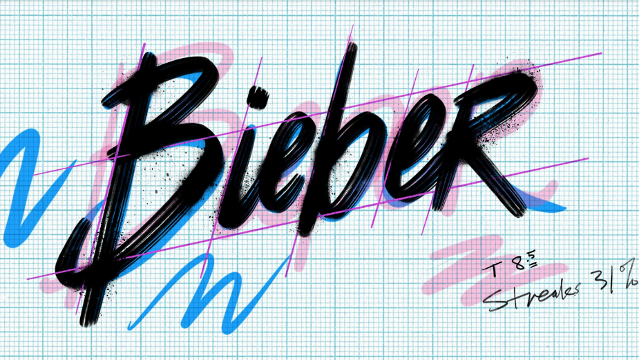
Above: Stefan’s work on ‘Life Is Good’ with Director X for Future+Drake contributed to the project’s multiple award nominations at the VMAs and Grammys this year.
LBB> When did you first discover design?
Stefan> I discovered it really early on. My father was a meteorologist by day, but did freelance graphic design and illustration in his spare time. He had design books all around the house. I was always studying those, and was also trying to emulate the comics I read — especially the sound effects and splash pages. Archie and Spiderman always had crazy typefaces, with overlapping letters. Then I’d start drawing my name in that style over and over again. It just becomes a thing.
I was always drawing from that point on. To my father, Mad Magazine was a great resource - so many illustration and type styles. If we wanted to find a cool looking letter ‘A’, or an example of how to draw hands we could flip through and explore a variety of styles to build off of.
LBB> What led you to music typography?
Stefan> Since I can remember, I’ve always loved music videos and motion graphics. At a young age, I started visually bookmarking what I thought were cool examples of moving type. I remember recording The Cannonball Run when I was about 9 or 10 and being really impressed with the title sequence for “The ABC Friday Night Movie” — it was even better than the movie itself.
I was also really influenced by style and mood. There was also a Honda scooter commercial with Lou Reed - the editing and the look of it was really well done. After seeing that, I knew I wanted to work in television and graphic design. I didn’t know what roles existed, or how I’d get there, but I knew that’s the field I wanted to be in.
I had studied fashion at Ryerson, and then began working at MuchMusic, which was Canada’s music video station. There was an art director there, Andrew Young, and he was a huge influence on me. Andrew took a mixed media approach. He would print out letters, cut them out, reassemble the pieces, scan them back in and create something unique. Everyday at Much involved designing print and motion graphics. One day it’s a promo for a Spice Girls marathon weekend, another it’s an album cover for an alternative music compilation. You always had to switch up the style to match the genre, which was a fun exercise.
LBB> What is it like to bridge the gap between design and the music scene?
Stefan> Honestly, I don’t see a gap. Popular music has always been visual. You need one to have the other, whether it's the album art, promotional posters, or music videos. They’re intertwined.
LBB> Who are your inspirations?
Stefan> When I was in school, and starting designing in the ‘90s, I was in what I refer to as my “magazine renaissance.” Details, Raygun, Detour, The Face, Vogue, Collezioni and Interview magazine were essentially my Internet. I would see things I liked, cut it out and put it in my swipe file. I pulled a lot of interesting typography from there. I’m also inspired by a lot of type foundries like Hoefler & Co. and House Industries.
Show openings and title sequences have always been inspiring. Mrs. America had a really well done title sequence by yU+co. Abstract: The Art of Design on Netflix is really interesting as well — the scale of the type and how they handle it versus the image is really smart.
LBB> What do you have to consider in order to get the right look and feel, not only for the song, but for the music?
Stefan> It helps to be a fan of the music. You have to like the song you’re working on and for the most part that’s been the case for me. A lot of it isn’t just getting the right look and feel for the artist but also for the director. They’ve put a ton of work into coming up with the concept of the video and you really want to respect that vision while supporting the song and the artist. It’s a bit easier to find that balance when you know each other really well. I’ve worked with Director X and Karena Evans of FELA on a number of projects with different artists, and I can usually get a sense of what they need really quickly and get the right look that makes everyone happy.
There are always constraints. You might only have two seconds to work with, which informs the animation, scale and positioning. There’s also the matter of making sure that there’s enough contrast with the image so you can read the type, while not taking away from the singer in the video.
Above: A gallery of Stefan's work and process.
LBB> Do you ever receive particular guidelines for the typography?
Stefan> Rarely. But it does happen. Early on, I was slated to do the titles for Drake’s Hotline Bling, and I had come up with an approach. But then, in the eleventh hour, the decision was made to follow the print artwork for the single (which was a good call)! That way, everything could be consistent.
But a lot of the time, especially since I work with clients that I’ve established a trust and rapport with, they’ll simply say “here’s the song, I’d love to see what you come up with.”
LBB> When it comes to your custom typefaces, where do you take your inspiration?
Stefan> Anywhere really. As a designer you’re always designing. Even something as simple as walking down the street, I find myself taking in everything. Maybe it’s a restaurant sign, or some street art - really anything can inspire your next design. It’s important to always carry a sketchbook.
Whenever I've travelled to NYC, I go to the wall at Bowery and Houston - they’re always changing it up and it’s exciting to see what they’ve done. That corner has always been a rich source of inspiration.
LBB> And what album covers/ music videos have the most iconic memorable and inspiring typography in your view?
Stefan> In no particular order: Peter Saville’s New Order’s covers. Duran Duran’s Rio. Beastie Boys Check Your Head. The Ramones logo. The Nirvana logo. The album cover for Taylor Swift’s 1989 is fantastic, just a really simple Sharpie type - understated but impactful. All of So Me’s work for Justice including their video for DVNO is awesome. Kanye West’s Paranoid has great typography in it. Van Halen’s Right Now, which has a lot of type in it, was groundbreaking for a moment. Not too many artists were really doing that at the time. And I have to mention late ‘80s early ‘90s Nike commercials as being super iconic as well. The one that used John Lennon’s Instant Karma is really dynamic.
LBB> Do you think that typography is having a digital revival right now, in the music industry?
Stefan> I sincerely hope so. I don’t know where music is going. It’s always changing, evolving. I love that music videos are still being made. No matter where they’re being shown, I want to be a part of making them.
LBB> Finally, do you have a favourite typeface? Or is this like picking a favourite child!?
Stefan> Haha, I know it’s a cliché but how can you not love Helvetica? It’s so clean and versatile.
But I always have new favourites. It comes in waves. I recently rewatched the movie Paris Is Burning. The title cards are so stark, so plain, so matter of fact. The use of Franklin Gothic is really impactful and does a great job in separating the chapters. I guess I’m on a Franklin Gothic kick right now.
The custom type design I did for the Future+Drake’s “Life Is Good” is a recent favourite. In this case, I listened to the song a bunch of times, and then started by drawing the stylised letter ‘S’ (drawing your name over and over is key!). Once I had one letter working, the next few letters started to dictate how the others should look and then you have most of the remaining alphabet. I really liked how this one turned out. It’s big, bold and impactful, which goes with the feel of Director X’s video. And I also got to create the fake MTV logo that appears about two thirds of the way in which took me back to my days working at a music video station.


