Laura's Word 7 March 2013
Whaam! In an explosion of Benday dots and primary colours, Roy Lichtenstein has crashed into London. The recently opened retrospective at the Tate Modern is proving something of a blockbuster as visitors queue for the chance to get face to face with the pop art pioneer’s most iconic work. But it’s also reignited the lively debate surrounding artful appropriation and plagiarism. Throughout its history, advertising has been known to, err, ‘borrow’, but has itself served as one of Lichtenstein’s muses.
So there’s a circular relationship going on between Lichtenstein and the ad industry – just as he took and transformed images and signage, versions of his breathless comic book heroines find themselves popping up in uninspired print ads.
The interesting but rather obvious discussion about originality, cliché and creative cat burglary has been playing out in the press reviews and features about the exhibition. I watched an impassioned Dave Gibbons (Watchmen artist – which you knew, of course) attack the fiery ‘Whaam!’ on a recent BBC documentary, defending the unsung comics illustrator Irv Novick who fed the artist his inspiration.
But beyond that, Lichtenstein’s use of images is also about shorthand cues and a shared visual language. By using elements from pre-existing shapes or illustration he was able to create immediate context and recognition. His work was about mid-20th century pop culture – and we know that because it looks like mid-20th century pop culture. As the man himself once said, “"Pop Art looks out into the world. It doesn't look like a painting of something, it looks like the thing itself."
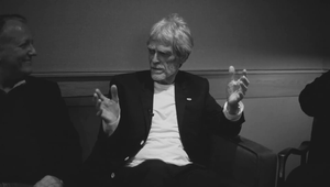
So with all this swimming around my head, there was a moment that really stood out to me as I carried out this week’s ‘5 Minutes With…’ interview with Arnold Amsterdam ECD Paul Stechschulte.
I asked him about the key challenges that face ECDs tasked with nurturing the next generation of creative. He explained that for him, the biggest struggle is to help these creatives communicate their ideas in a way which reflects their vision, rather than relying on easy shortcuts, which inevitably diffuse their originality. “The question I always ask is ‘is that really how you wanted it? Is that really how it is in your head or is that how it is because you found a picture on Flickr and that’s now what it’s become?’”
It’s a phenomenon that many on the production side of the industry are pretty familiar with too. How many times have we heard production companies say of agencies – or agency producers of clients – “they want to see their ad on the reel before it’s even shot”? And, aside from the obvious risk-aversion, it’s also because of the difficult balance advertising must strike between originality and communication, at least in traditional channels.
And it was this shorthand and the reliance on convention within the advertising and comics of the 50s and 60s that seemed to attract Lichtenstein. “I'm interested in what would normally be considered the worst aspects of commercial art. I think it's the tension between what seems to be so rigid and cliched and the fact that art really can't be this way," he once said.
And whether you buy Lichtenstein’s pitch as a game-changing artist (I’m inclined to) or view his justifications more sceptically, his work has plenty to offer anyone working in advertising. There are the kitsch kicks to be had from pieces which arose in New York at the same time that adland was experiencing a so-called ‘Golden Age’. But far from being simply magnified nostalgia, advertising and Lichtenstein look like they still have plenty to say about each other today.

