


CRO Checklist for Mobile: Start with the Basics

It goes without saying that mobile devices are incredibly important for your conversion optimisation. In fact, for many years, “mobile first” thinking has been one of the most important developments around. That’s why mobile phone applications are becoming increasingly sophisticated.
Take Progressive Web Apps, for example. But anyone who listened closely during the Conversions@Google in Dublin would have heard more than just praise for all the cool, new innovations that will lift mobile CRO to unprecedented heights. Despite the praise, moderating voices emphasised the important to first get the basics right before further optimisation. Because you can optimise all you like, but if you do not get the basics right and your platform is not properly accessible for all mobile devices, further optimisation is pointless.
According to OptimiseofDie’s Craig Sullivan, device compatibility is like a pyramid. You need to start with the foundations, and then work your way through the different stages until you reach the top. The perfect starting point.
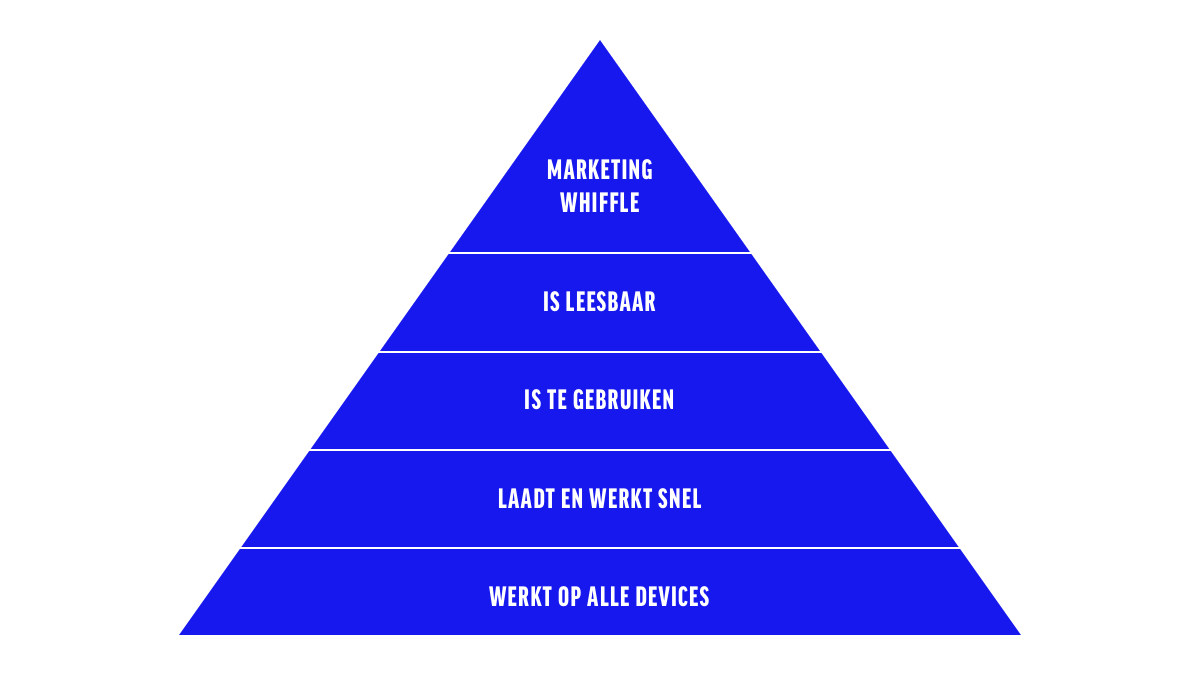
1. WORKS ON ALL DEVICES
Seems obvious right, but when did you last do a thorough check of all device types? And not just for your primary conversion paths, but all across the website? These extended checks often get overlooked given the pressure coming from other work tasks however, constantly checking all devices is not necessary. Data analysis will go a long way towards getting the job done.
Analytics is the conversion specialist’s friend when it comes to checking whether your website is working properly across all devices. And if you want to get meaningful data, you will need to segment to a device-specific level. Imagine that , you want to look at performance on an iPhone 4 or a Samsung Galaxy S9.
iPhones are more difficult to split up in Google Analytics, therefore, you need to use the appropriate screen resolution per phone such as 414×736 for an iPhone 7+ or 8+. Segmentation for Android phones is easily done by model such as the Galaxy S7 for instance. Then you can plot the most important metrics for this level. What are the bounce ratios for your main landing pages? How do visitors convert for each device type? Where do they drop out in your checkout funnel?

Take a look at the example above, which shows that smaller screen iPhones have a worse conversion ratio. And why is that? Because platform navigation is not suitable for smaller screens.
Feeling a bit daunted by having to figure this out for all device types in Analytics? Don’t panic! This kind of work is easy to automate, e.g. by using Google Sheets. For example, you could use a sheet to retrieve automated data from Analytics for each device type and the most important metrics. All device data, for each and every device, will be listed for you at the click of a button (and just a couple of minutes wait).


2. LOADS AND WORKS QUICKLY
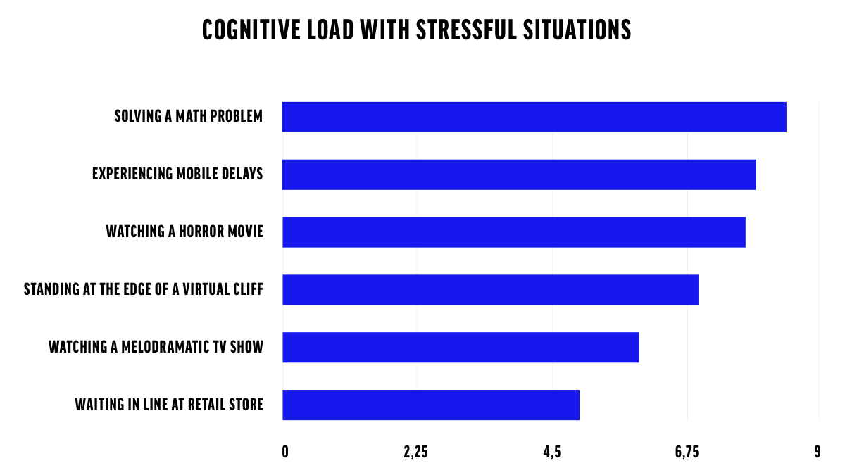
According to Luke Wroblewski, Product Director at Google, adults spend around three hours a day on their phones. We pick up our phones around 76 to 80 times a day. If you only count waking hours, this means each of us picks up our phone every twelve minutes. And guess what, more than half of those sessions on our phones last less than 30 seconds.
If your average session lasts less than 30 seconds, every second you have to wait for a mobile page to load is a second too long. So it doesn’t come as a surprise that people get annoyed by slowly loading mobile pages. In fact, research has been conducted exploring people’s stress levels whilst waiting for a mobile page to load. The result might come as a shock. We actually experience more stress whilst waiting for a website to load than watching a horror movie.
The graph below should convince any product owner or developer when you start talking about loading speed optimisation.
3. VISITORS CAN ACTUALLY USE IT
Contrarily to step 1 which was more about mobile CRO’s technical functionality, this step is all about usability. Is your website logical and user-friendly ?
Input fields are a good example of terrible usability. Why, in 2018, do we still show text input fields to mobile visitors who have to enter their phone number?
And then there are those tiny checkboxes or radio buttons that you regularly come across on mobile sites. Unless you happen to have a toothpick with you, selecting them can be a real challenge. Not to mention all of the non-aligning pop-ups on small mobile displays, making it utterly impossible to click them away.
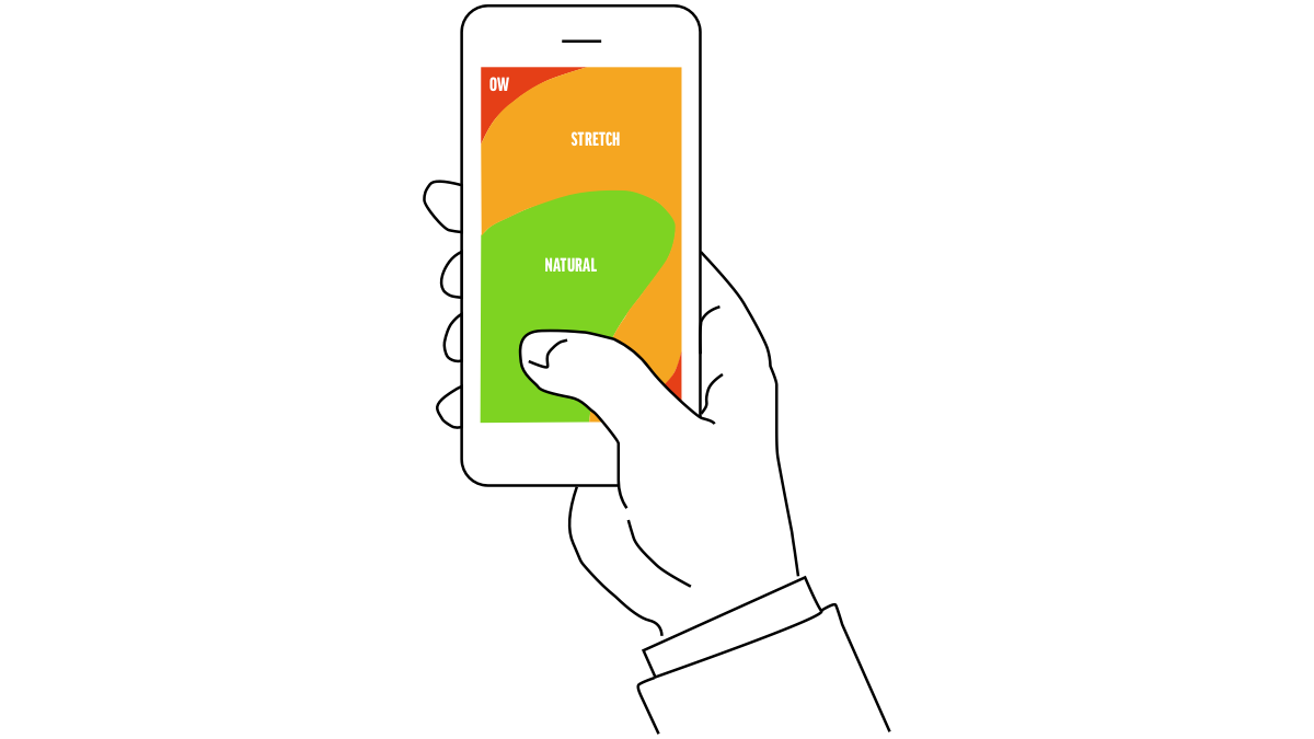
If you look at what we sometimes do to our poor mobile visitors, you could be forgiven for thinking we don’t really want to convert them. When designing for mobiles, remember that most visitors – around 75% according to Luke Wroblewski – navigate using their thumb. And swiping or typing with your thumb just isn’t that accurate.
That is why it’s good to adjust your interaction design to the way in which people navigate navigate. Interactions that can be useful are:
- swiping up to navigate downwards in a list
- tapping either side of the screen to vote
- swiping up to load more
- swiping down slightly to view the main menu
- swiping sideways to skip questions
These are all fairly basic and easy movements that you can make with your thumb. Moreover, it’s important to consider how visitors generally hold their device: often with one hand. This means certain parts of the screen are more difficult to access. The image below clearly illustrates this:
4. IT IS ACTUALLY LEGIBLE
This step really needs no explanation, make sure that all of the text on your website is legible. Fortunately, nowadays there don’t tend to be many problems in this respect. Most websites use a fairly decent font for the mobile version of their website.
However, legibility is not just about font size. You also need to consider:
- accessibility for people who are blind or visually impaired. For further information, have a look at the Web Content Accessibility Guidelines
- determine where the breakpoints are in your text and look for the correct ratio between fonts that are not too small and sentences that are not too short
- make sure there is sufficient colour contrast between your fonts
- at the risk of stating the obvious, use paragraphs and subheadings
5. MARKETING WHIFFLE!
Finished all the steps? Then you can get started with the proverbial icing on the cake, also known as the “marketing whiffle” as Craig Sullivan so rather bluntly put it during Conversions at Google. Go to town with search personalisation, machine learning, product recommendations, big data and storytelling (and the rest of the buzzword bingo). But if you really want to do your users a favour, first focus on the four steps above. Only then you will realise that nobody is as ready to convert as a happy user.


