Purple Creative Refreshes the World of Gambrinus Beer


Purple Creative have recently evolved and modernised the visual identity for Gambrinus, one of the biggest beer brands in the Czech Republic.
From packaging to POSM, they refreshed the entire brand world, making it more confident, crafted and charismatic.
Historically Gambrinus has always been one of the most popular mainstream brands in Czech but its reputation and appeal amongst its core male audience nose-dived around a decade ago due to a low-quality stigma. It subsequently lost volume, value and brand equity fast, so has had to go through a few years of brand building, recipe improvement and finessing the brand positioning.
As the final piece in the puzzle, Purple were asked to evolve the brand world to improve brand perception, which included crafting a new ‘patron’, their brand icon, to add gravitas, timelessness and a sense of craft.
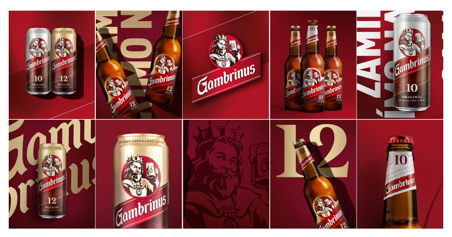
The Gambrinus icon was the key to the whole project; the distinctive brand asset at the heart of the identity that would add the most charisma, connection and contemporary cues.
“Our icon brings an important human aspect to the Gambrinus brand. He’s a kind of jovial beer saint, an historical beer-drinking hero that’s been celebrated in Central Europe for centuries. We wanted to depict him with the legendary status he deserved – still warm, welcoming and charismatic but less like a fairy tale or caricature.” said Dominika Drvoštěpová, Gambrinus senior brand manager.
Purple evolved the icon with the help of Chris Mitchell, illustrator and iconographer, making the patron prouder, more masculine and approachable. He was even made left-handed to add balance to the celebratory scene, raising his beer glass in a more active and dynamic way. The design also allows him to break out of his restrictive brand roundel.
Besides the icon, the Gambrinus word mark was tweaked to be more friendly, using less aggressive strokes, and proudly integrate the roundel on top of the B of Gambrinus. The red-focused colour palette added a strong brand signpost with a selection of graduations that can be used across all brand channels.
"The brief was to evolve certain aspects of the identity but I think the cumulative effect has had a profound and progressive effect on the whole perception of the brand moving forward. It’s modern, relevant and confident again, ready for the future. The icon is more noble but relatable, the brand colour is more single minded, the textural elements more crafted and the packaging now has a proud confident hero.” said Gwyn Edwards, Purple Creative director.
The new Gambrinus brand world will be rolled out in the Czech Republic from Q2 2024.